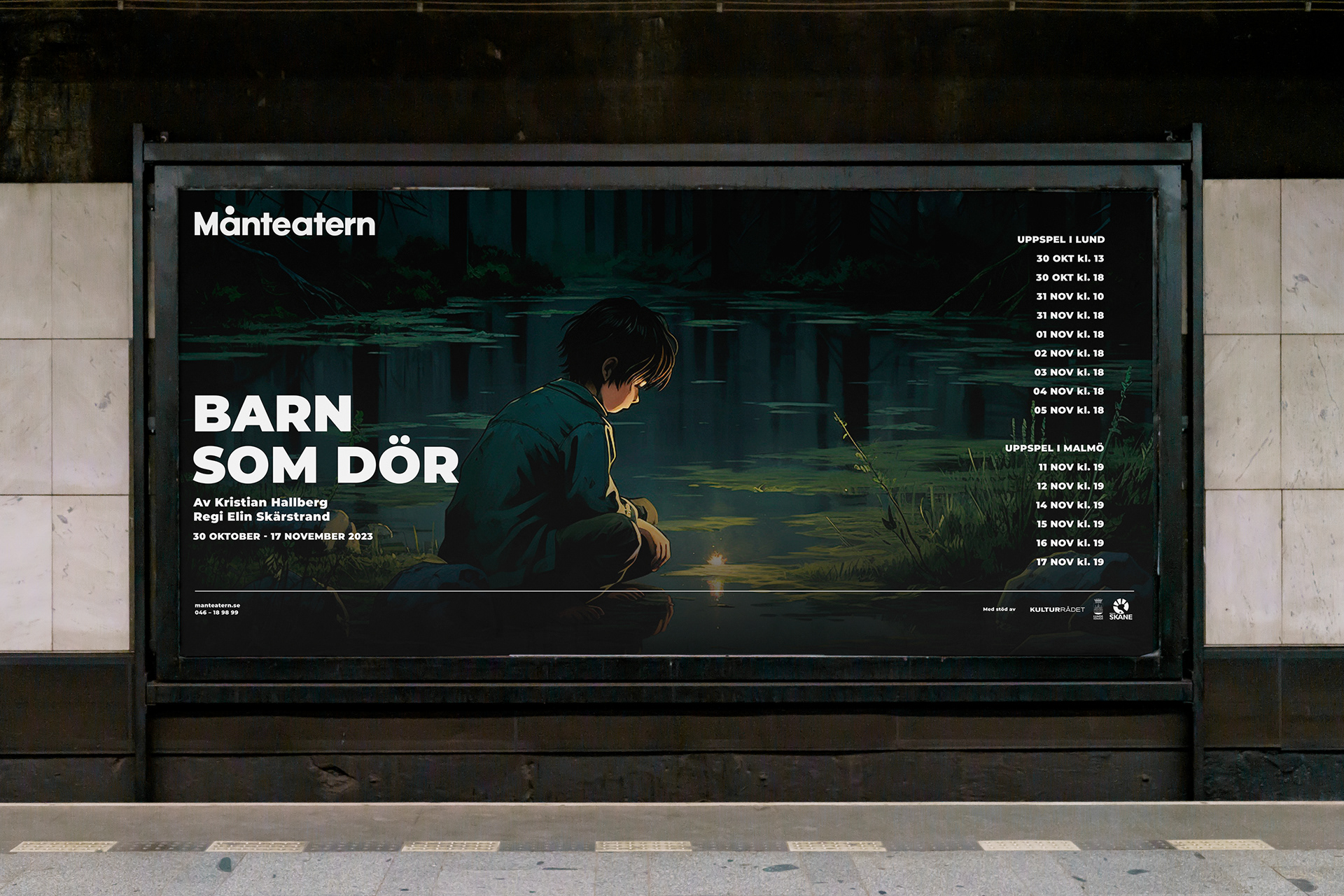
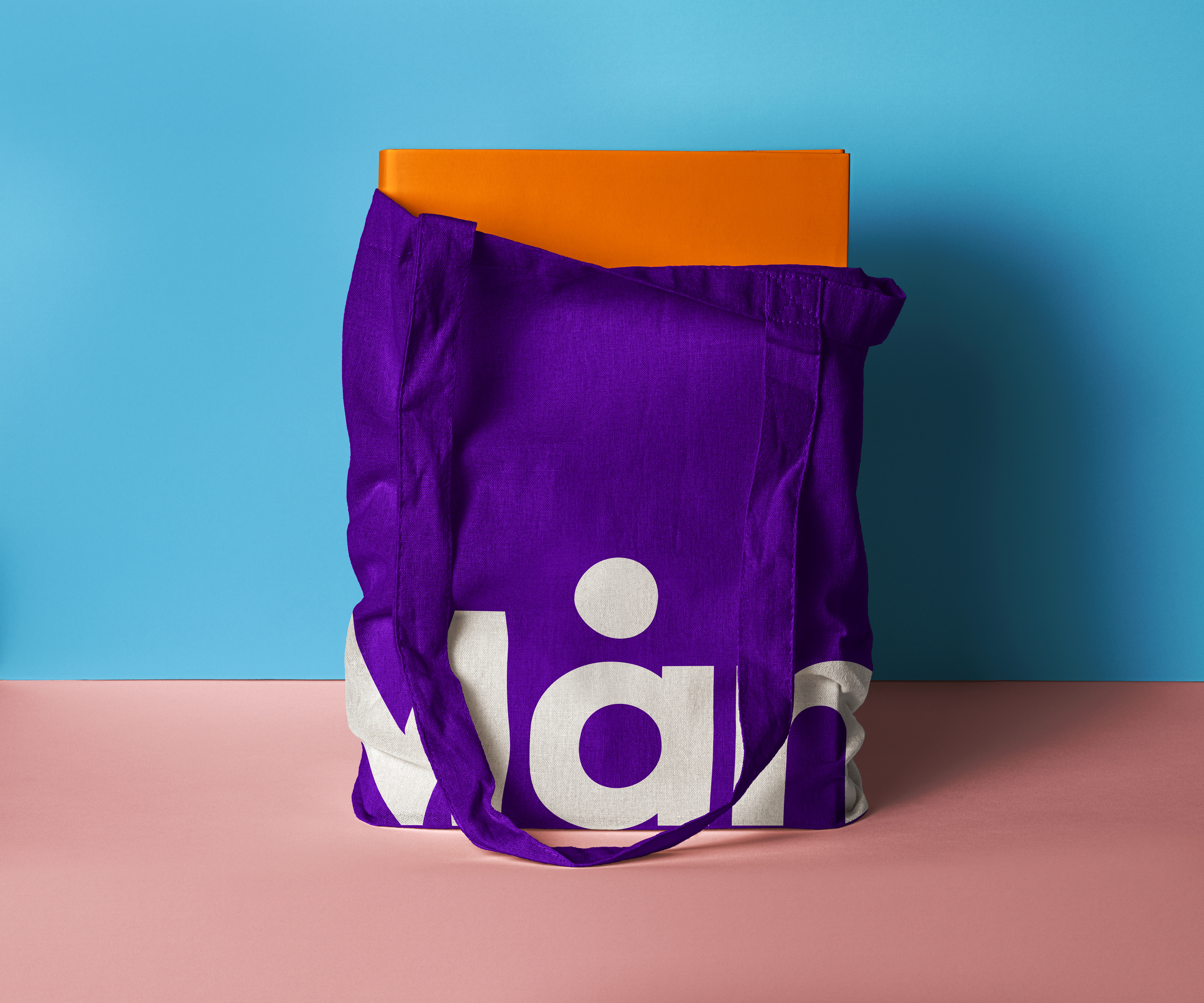
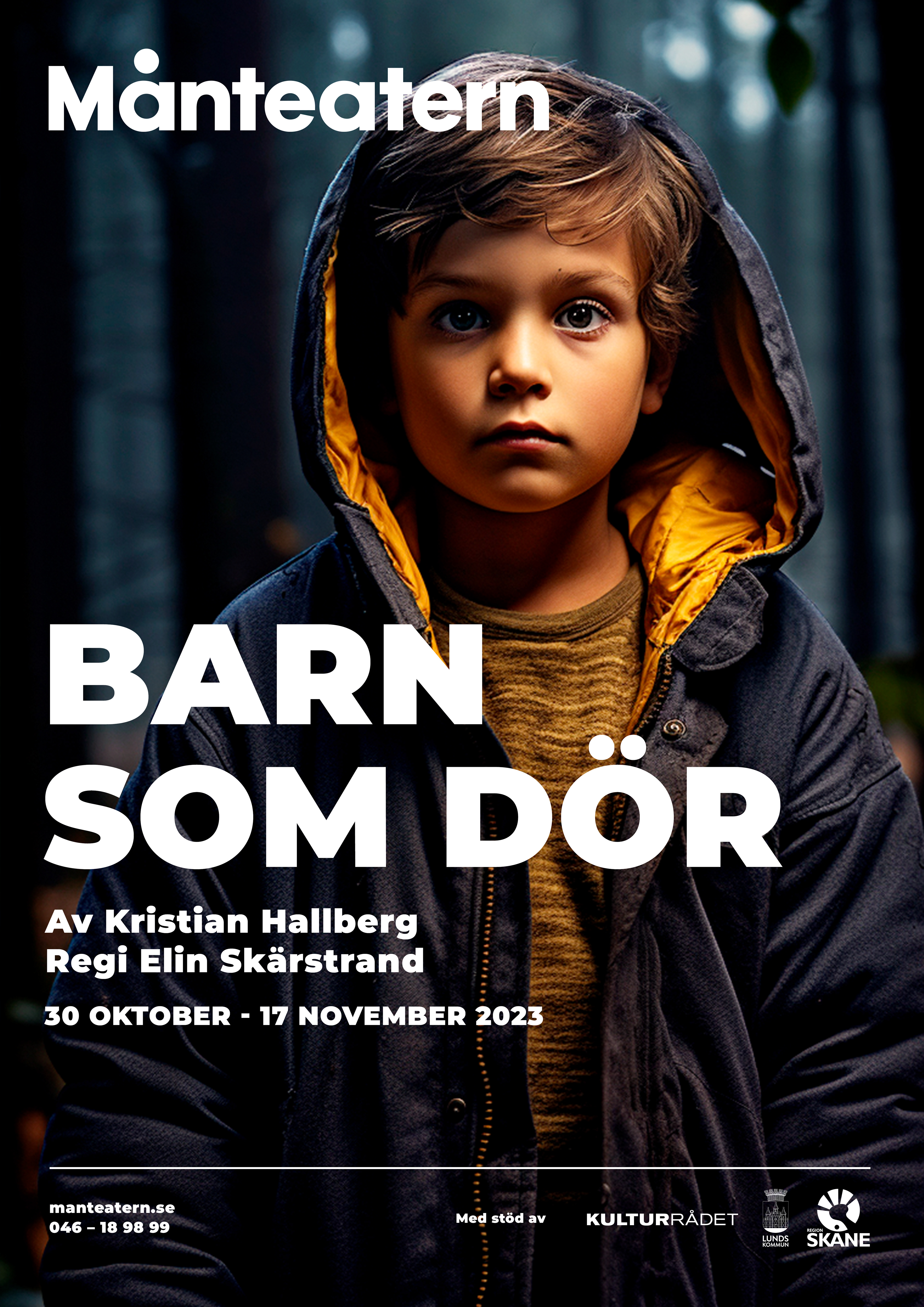
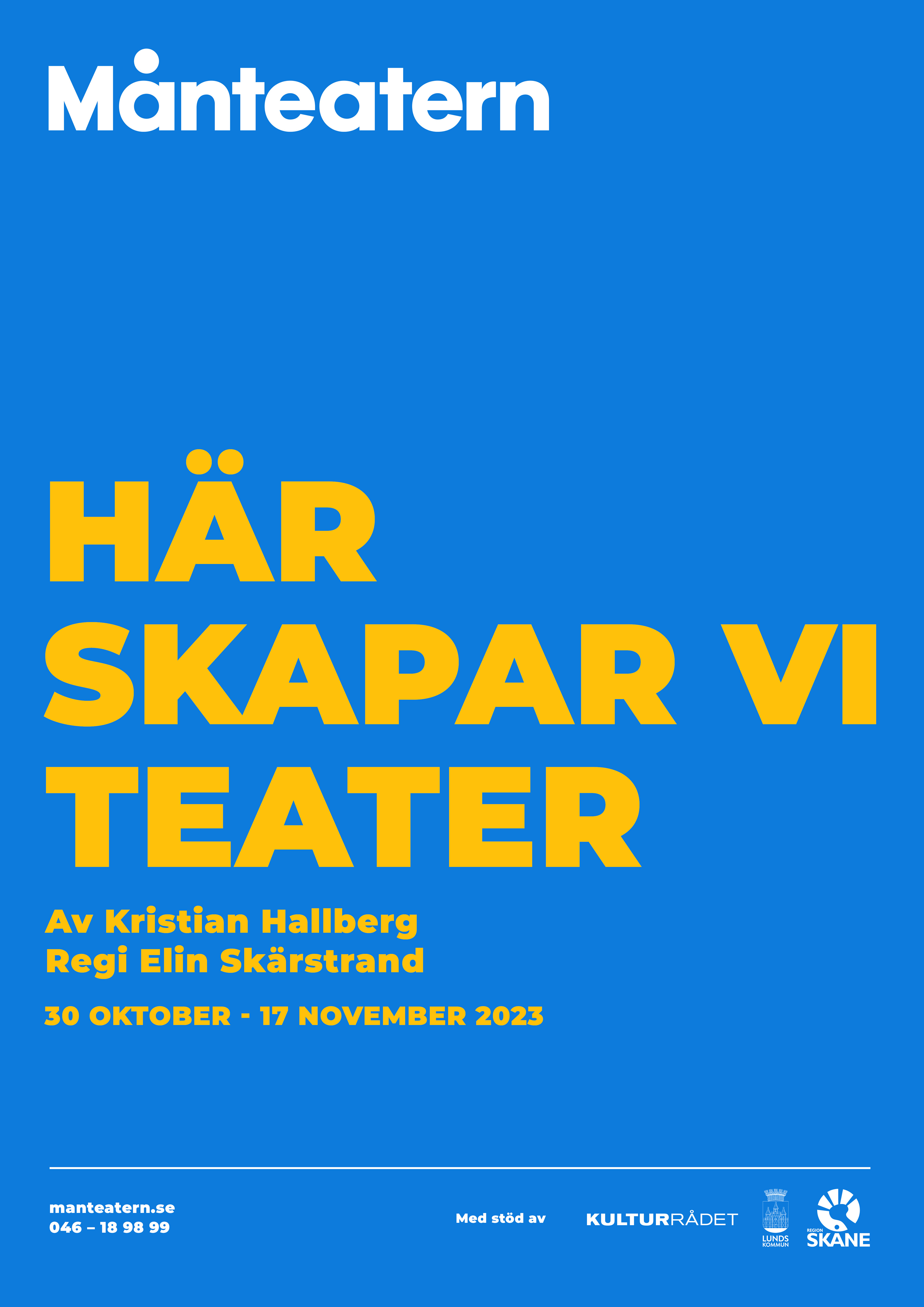
Visual identity and poster design for Månteatern, an independent theatre company based in Lund, Sweden, dedicated to creating performing arts that engage children and young audiences while addressing socially relevant themes.
The objective was to develop a bold, honest, and adaptable visual identity that reflects Månteatern’s vision and mission. The design needed to capture the company’s wide range of theatrical experiences and remain flexible enough to evolve alongside its artistic journey.
This project was developed during my studies in dramaturgy and theatre at Lund University, Sweden.
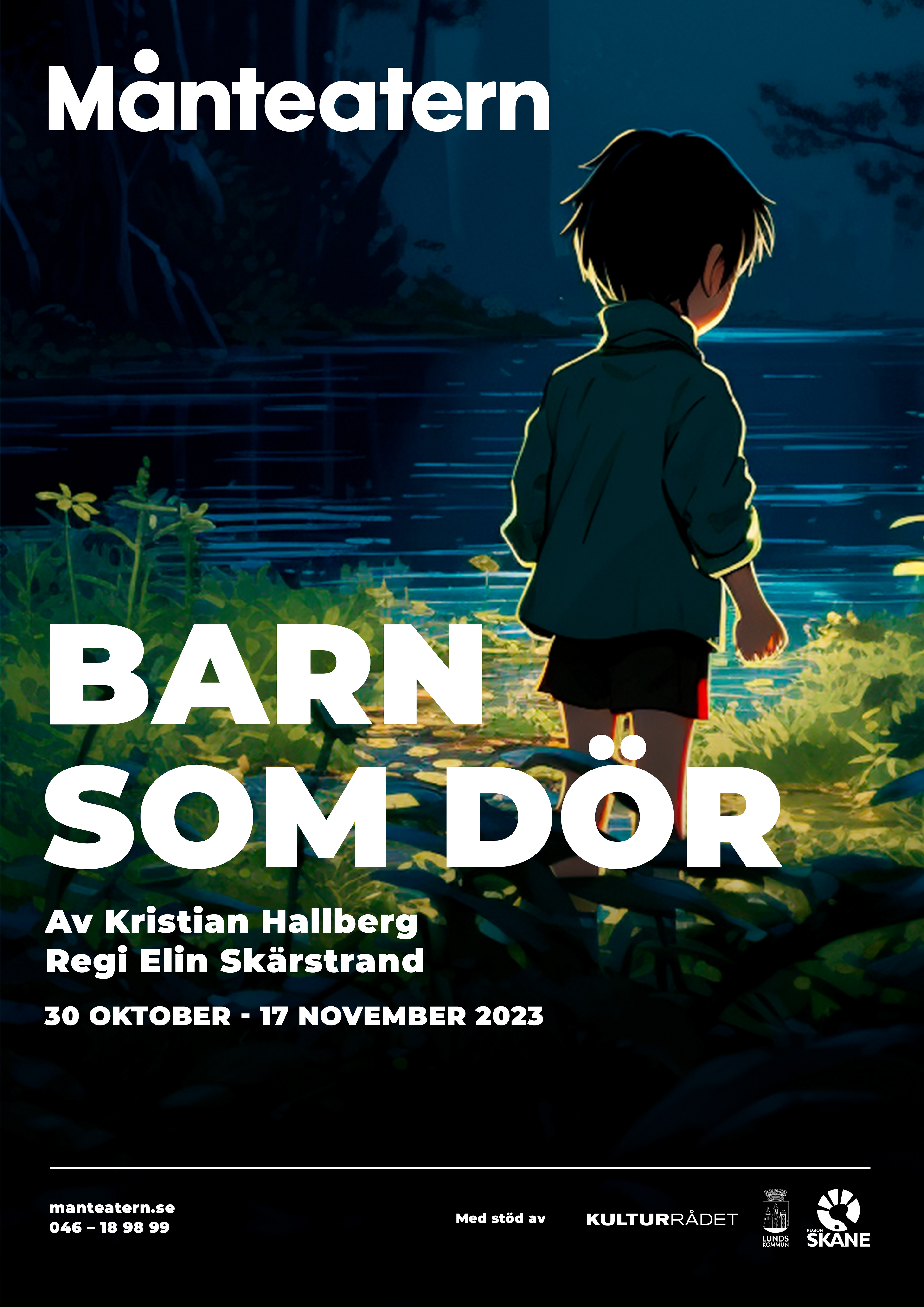
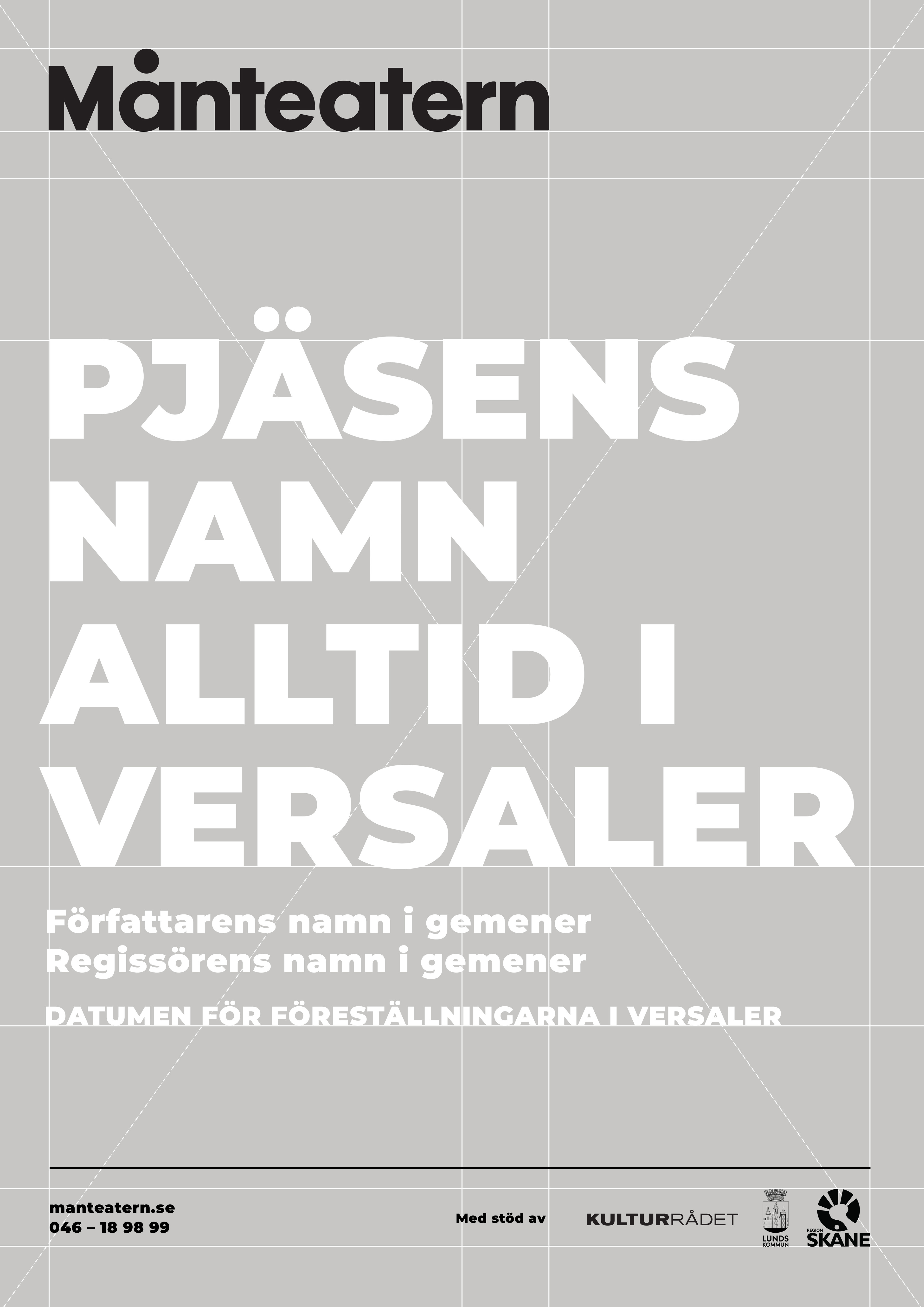
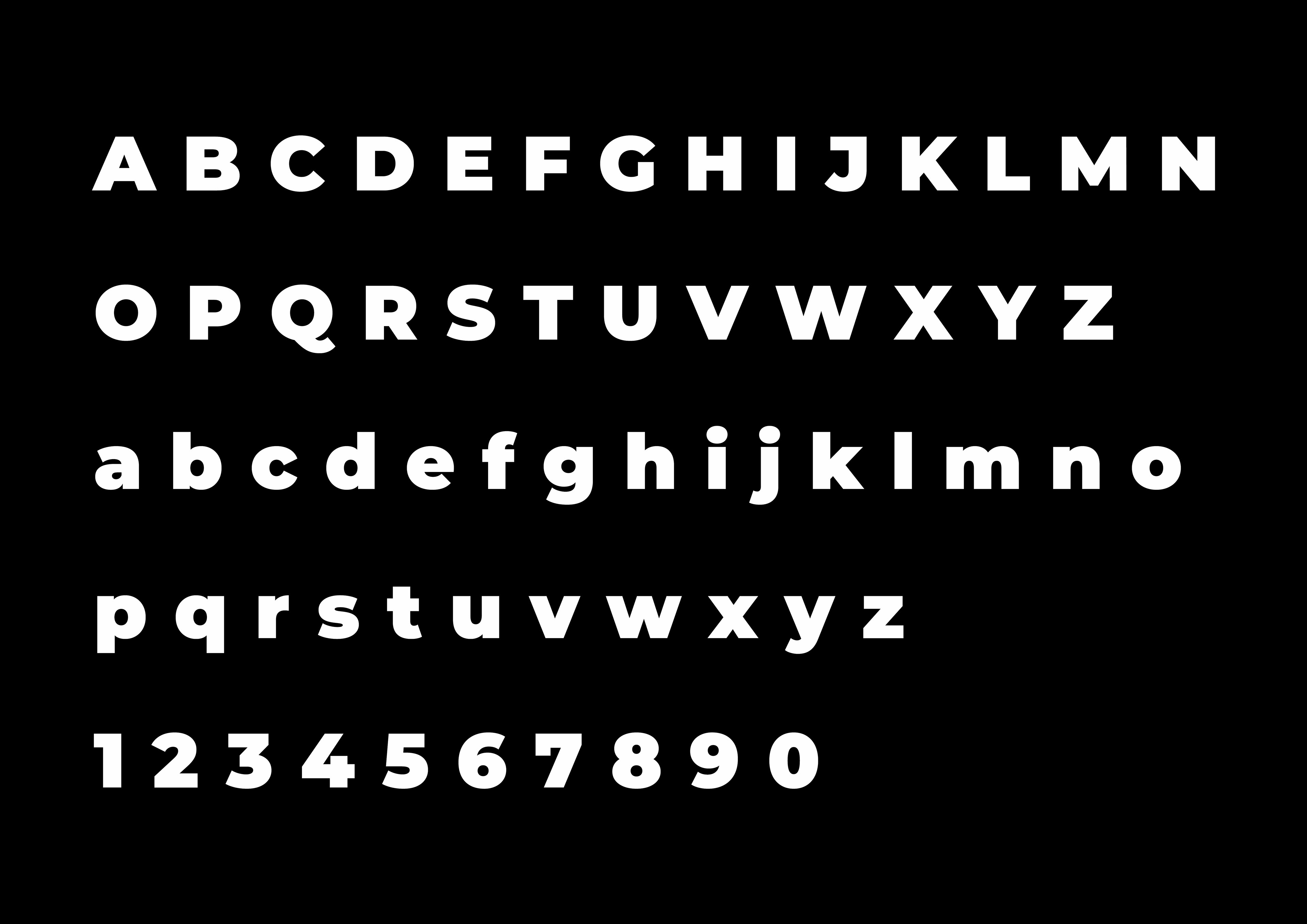
The typeface selected for text composition is Montserrat, designed by Julieta Ulanovsky and Sol Matas in 2010. Its high legibility, even at small sizes, makes it ideal for both print and digital applications. Montserrat allows for flexible layouts that can combine typography with photography or illustration, adapting seamlessly across various communication materials, including theatre posters.
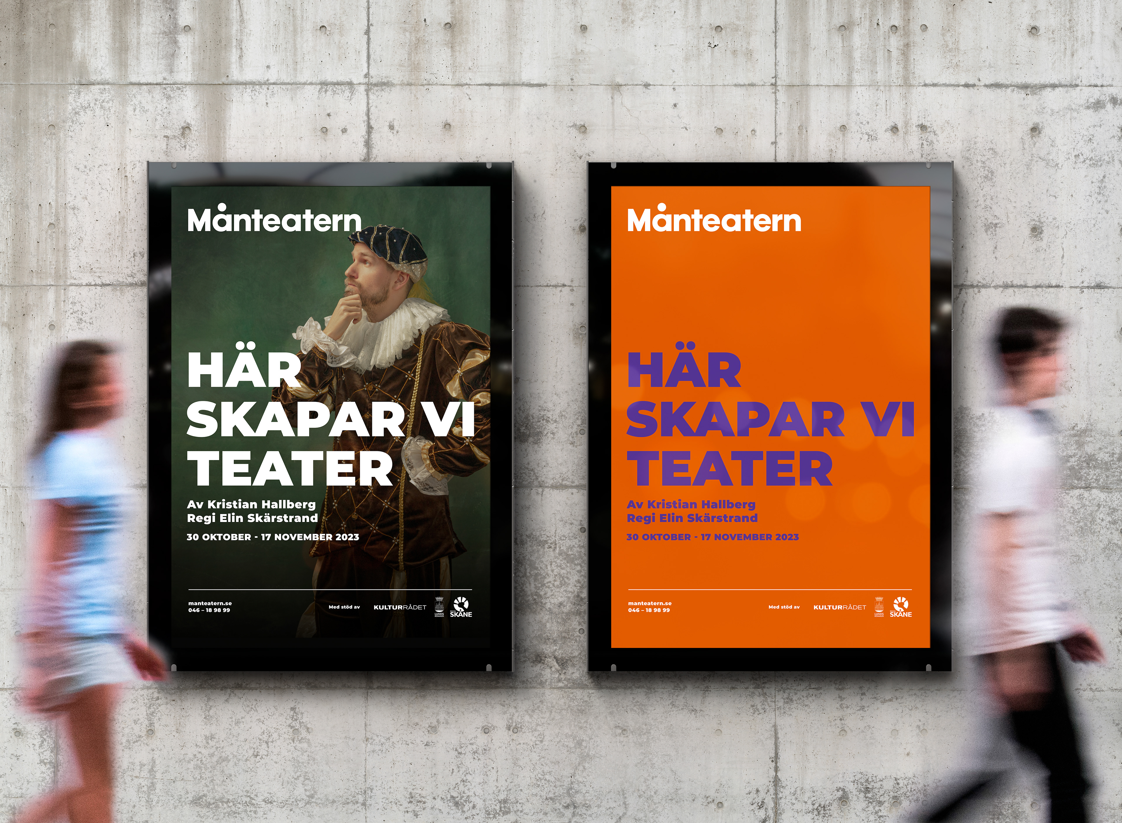
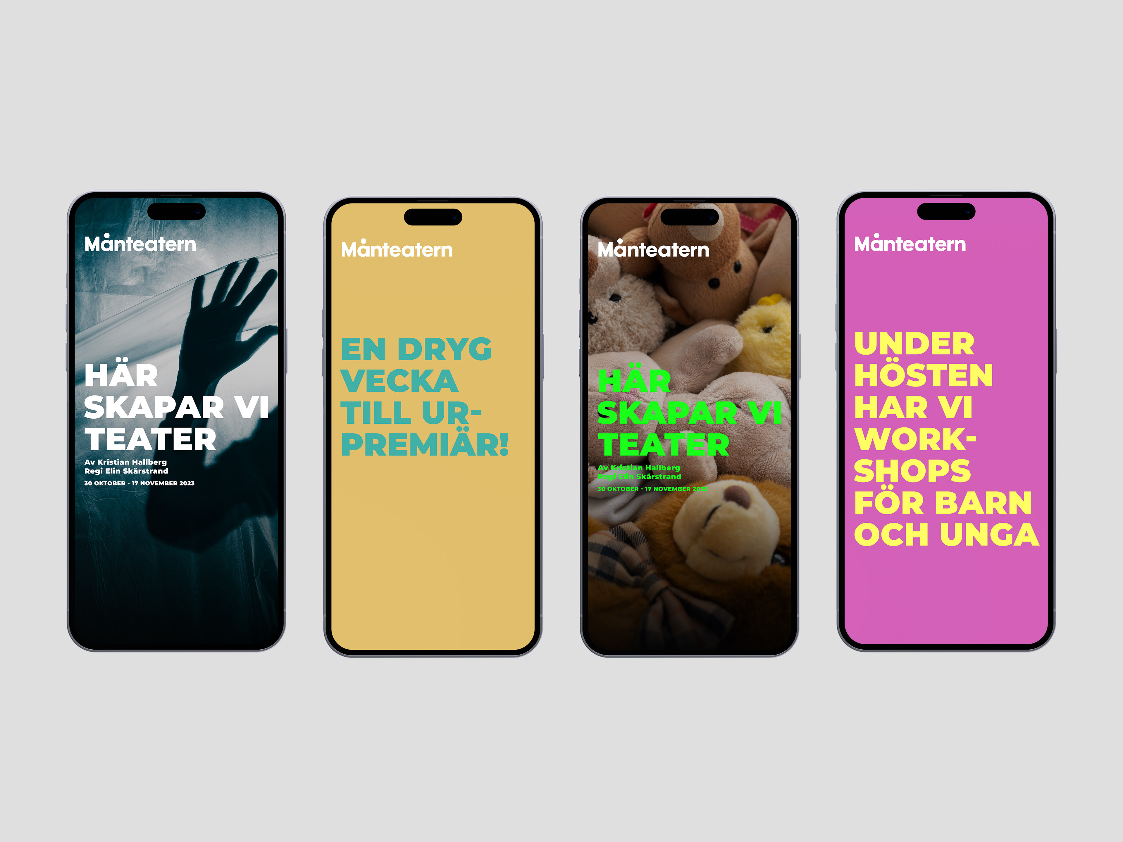
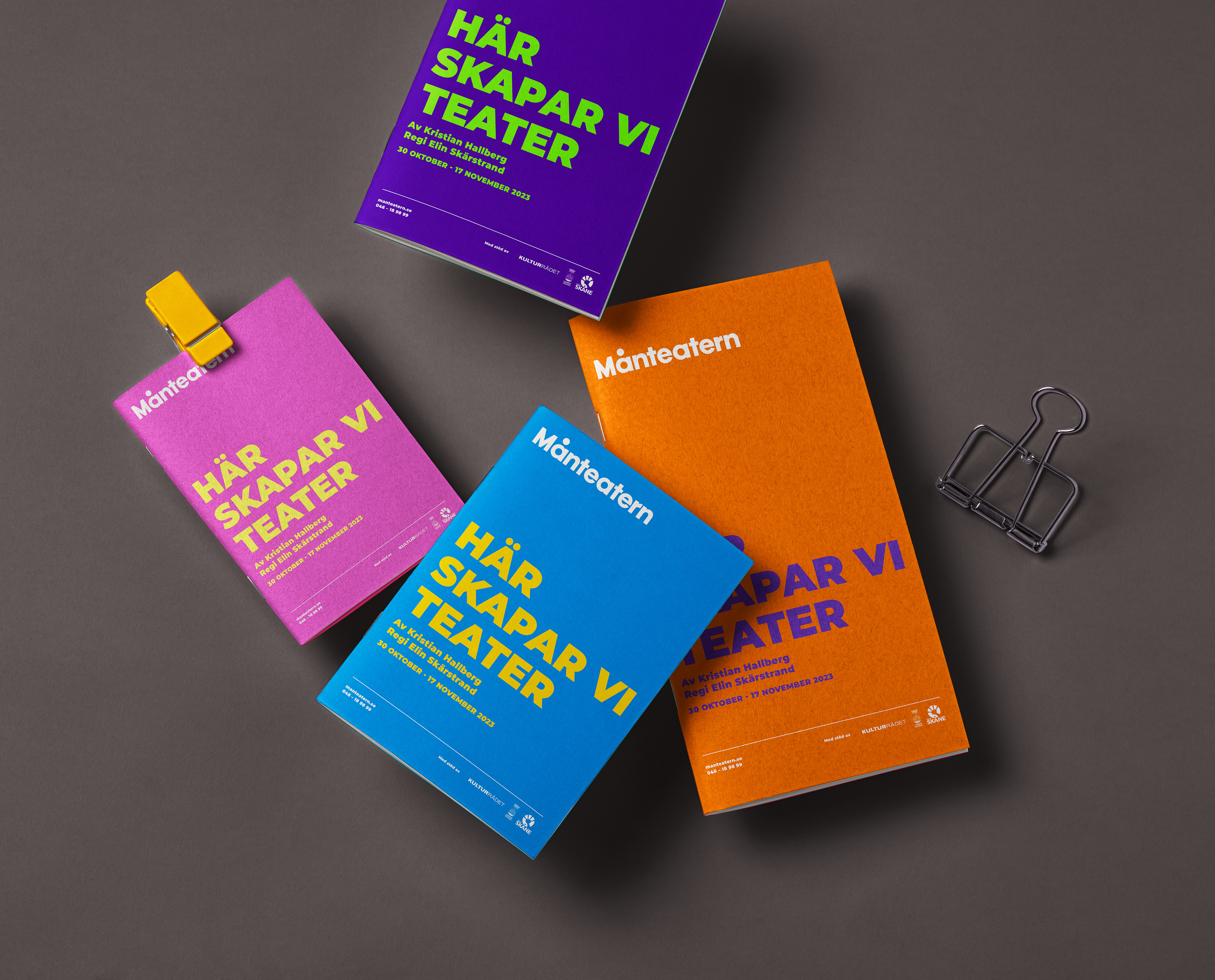
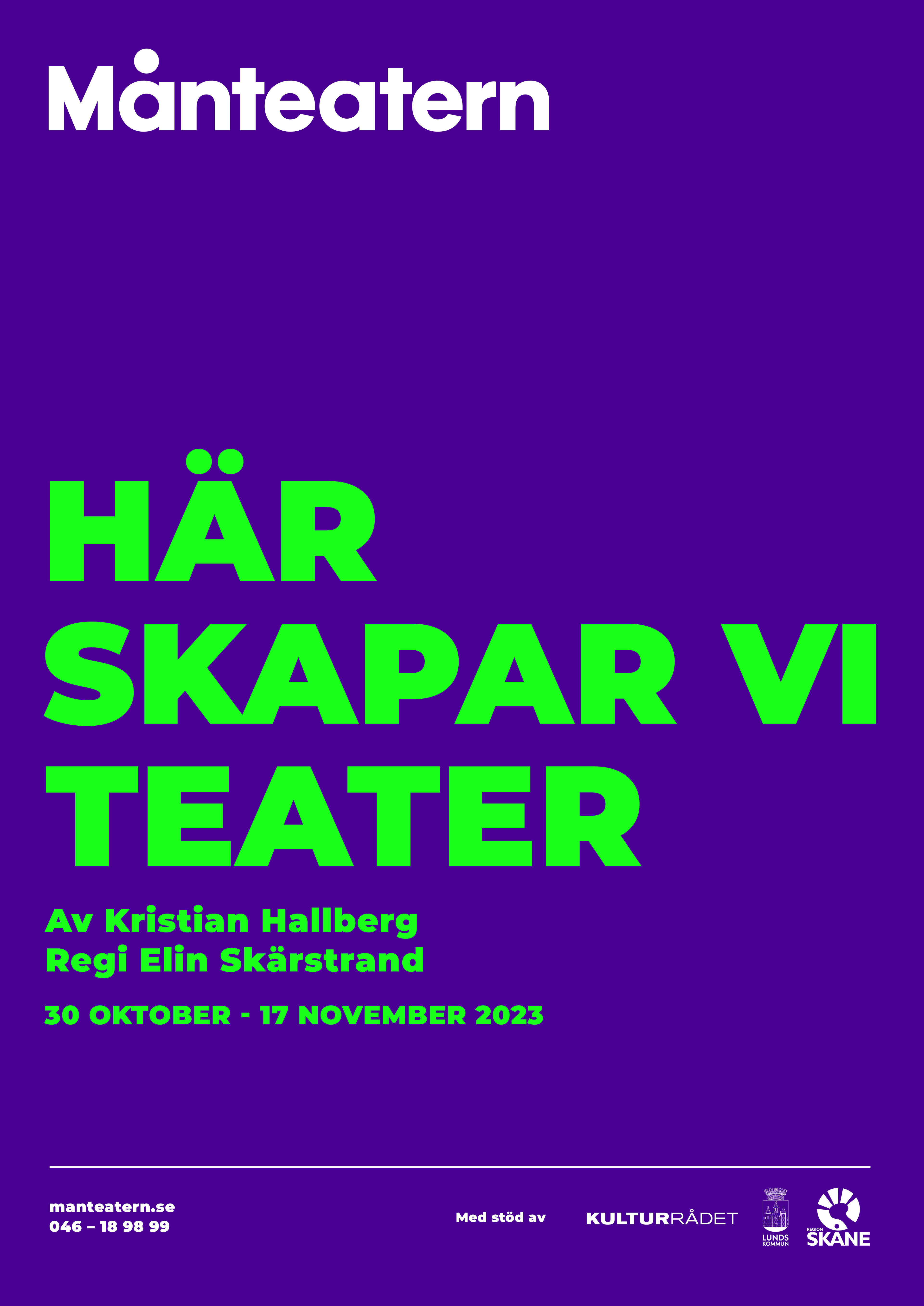
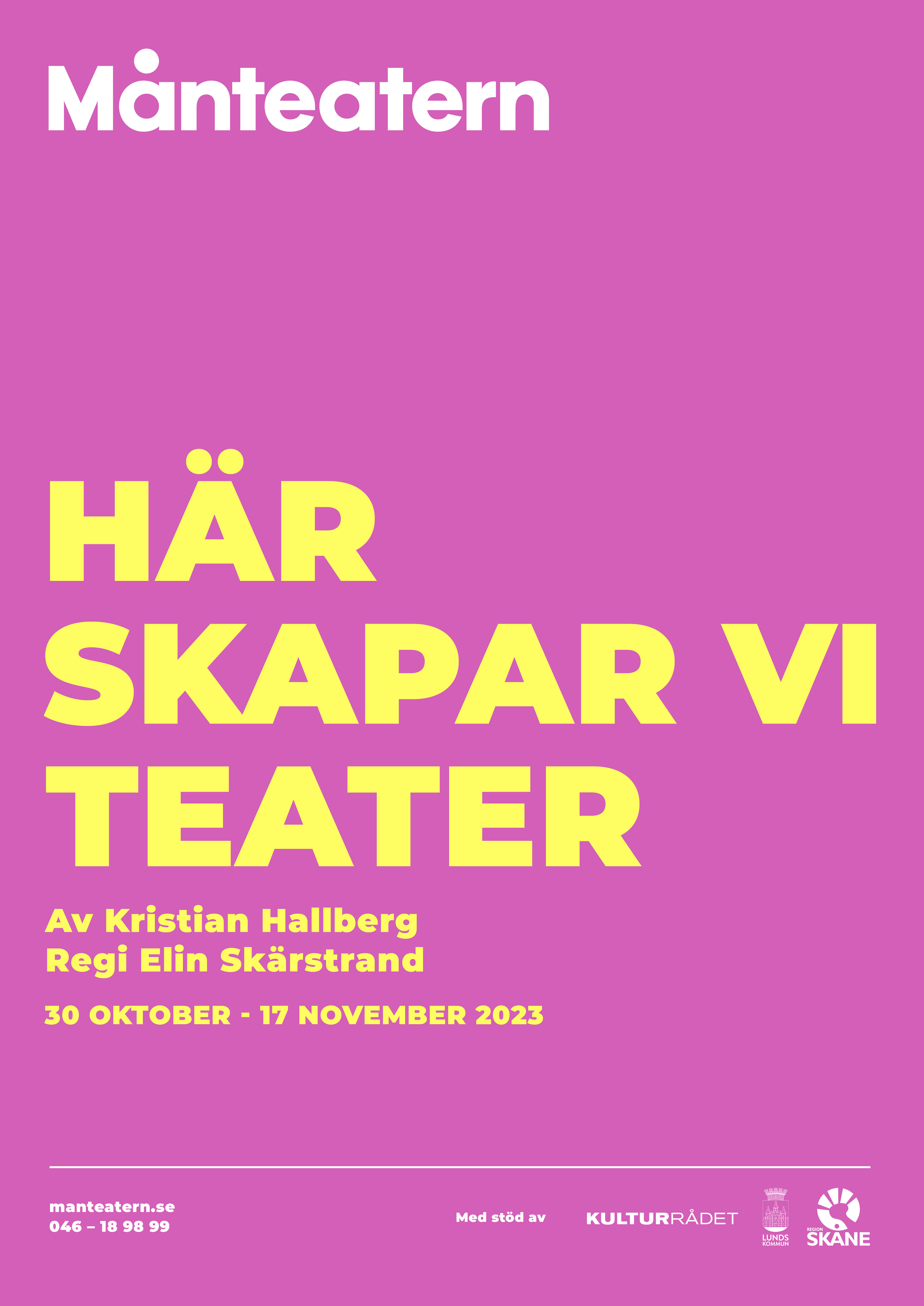
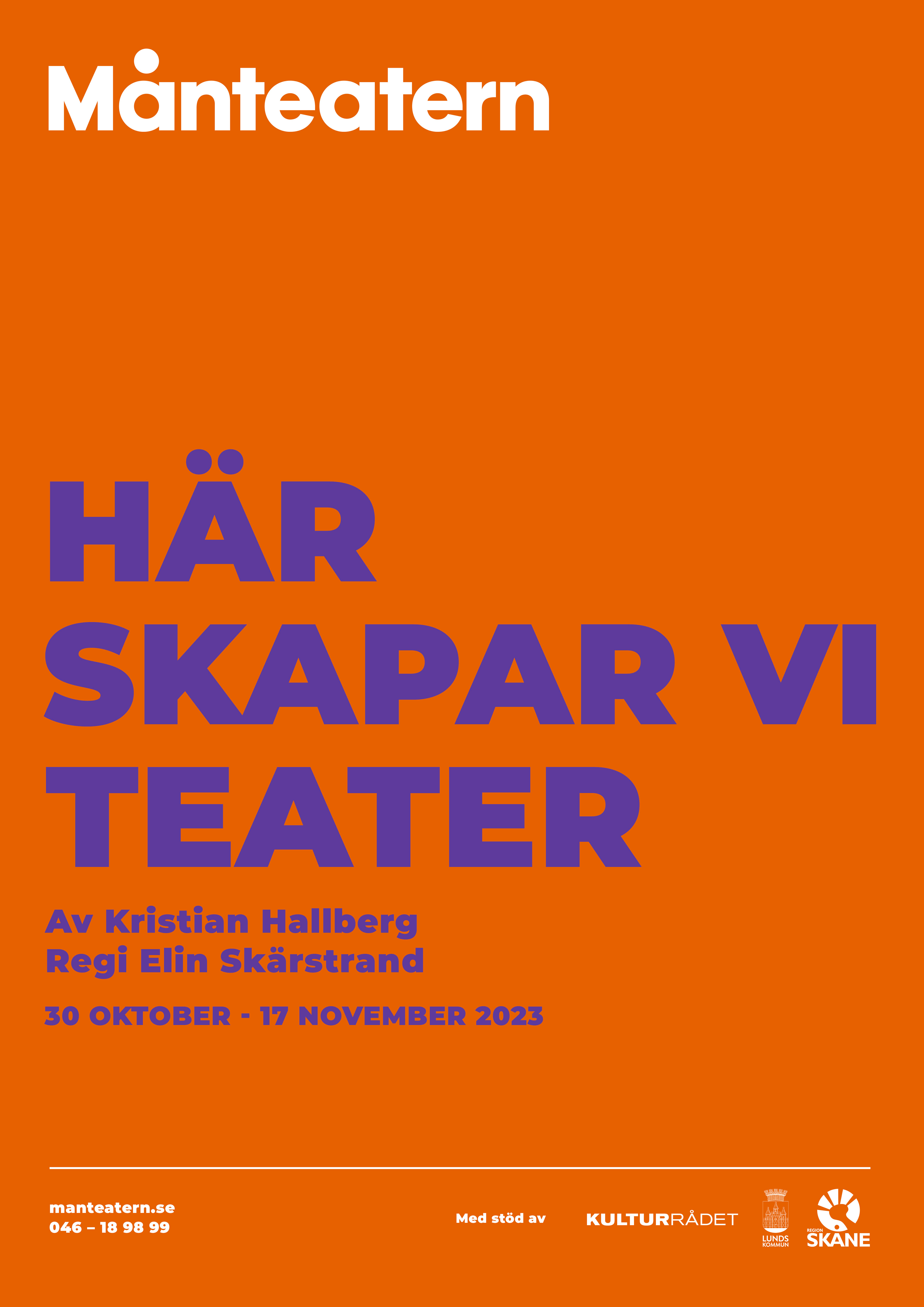
In the new poster design, the logo is strategically positioned in the upper left corner to establish a clear visual hierarchy and strengthen brand recognition.

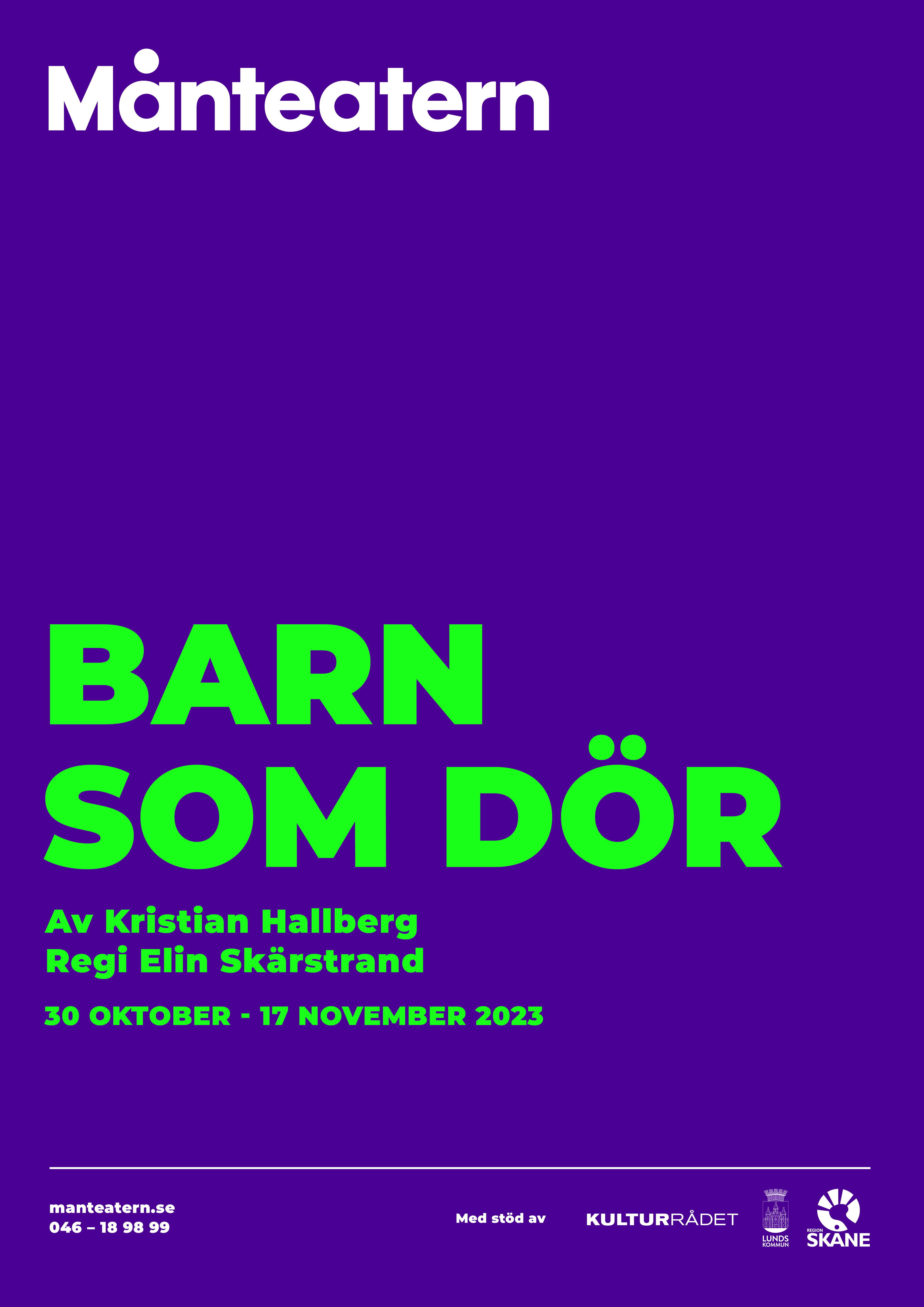
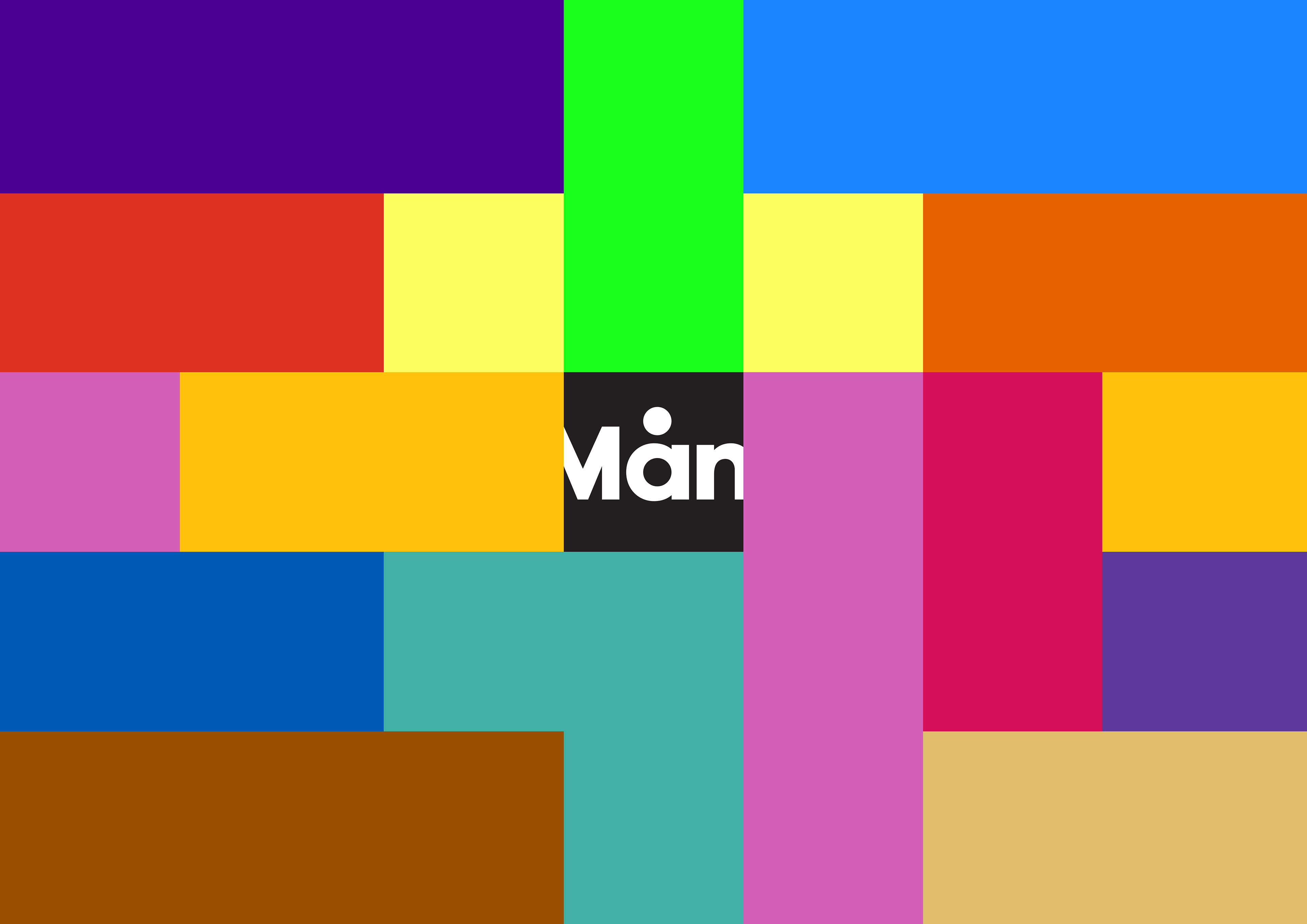
The colour palette brings energy and boldness to the identity, while also reflecting the rich variety of theatrical experiences Månteatern offers.
Approximately one in twenty people experience some form of colour blindness, meaning one or more types of cone cells in the eye function atypically. By mathematically simulating colour blindness, I developed a palette that maintains strong contrast, even for individuals with colour vision deficiencies or other visual impairments. This process resulted in several tone pairings that remain distinguishable under different visual conditions.
The aim was to ensure an accessible and inclusive design, one that works for a broad audience, with sufficient contrast between text and background to guarantee legibility across all materials.
The visual identity applied to printed and digital communication