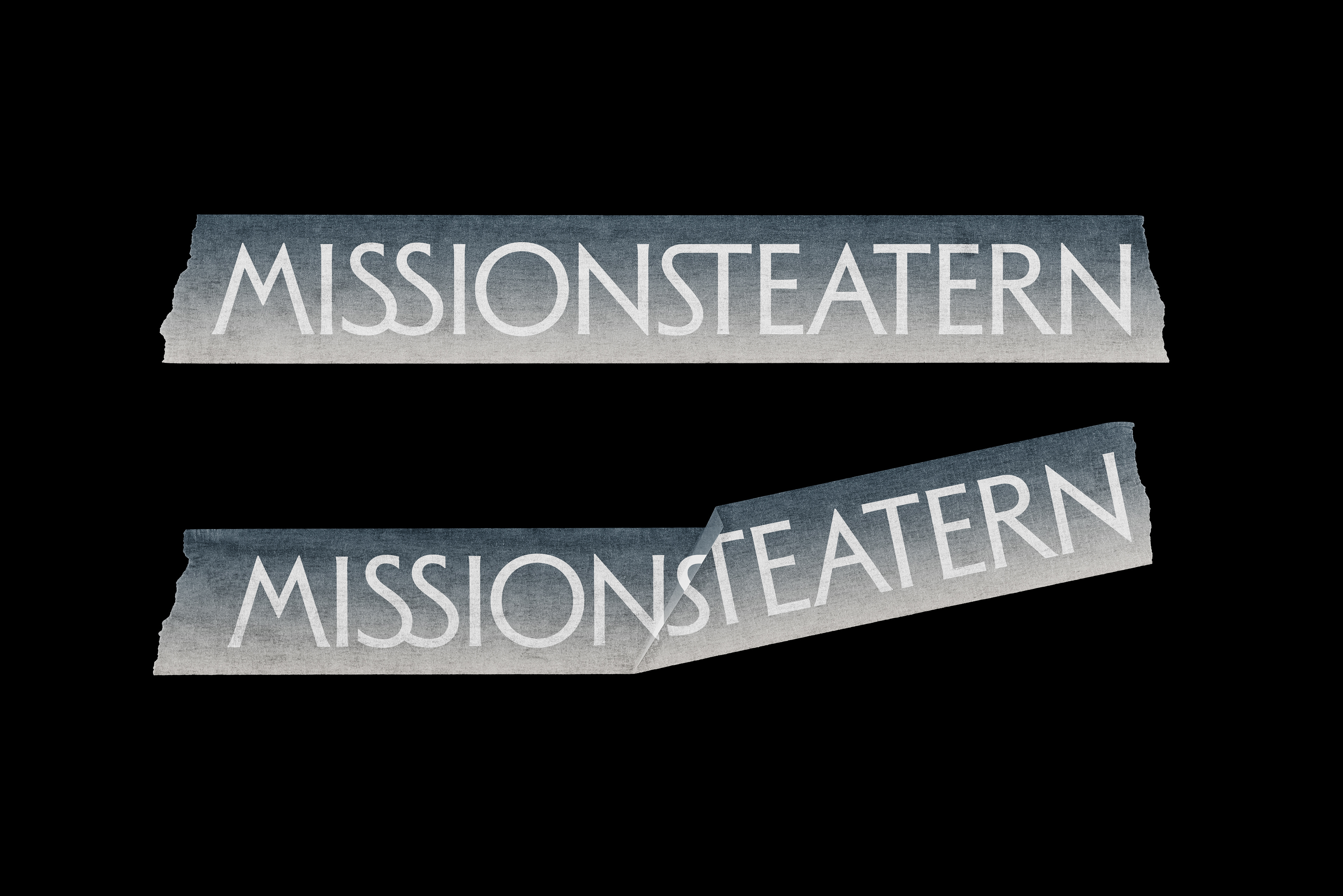
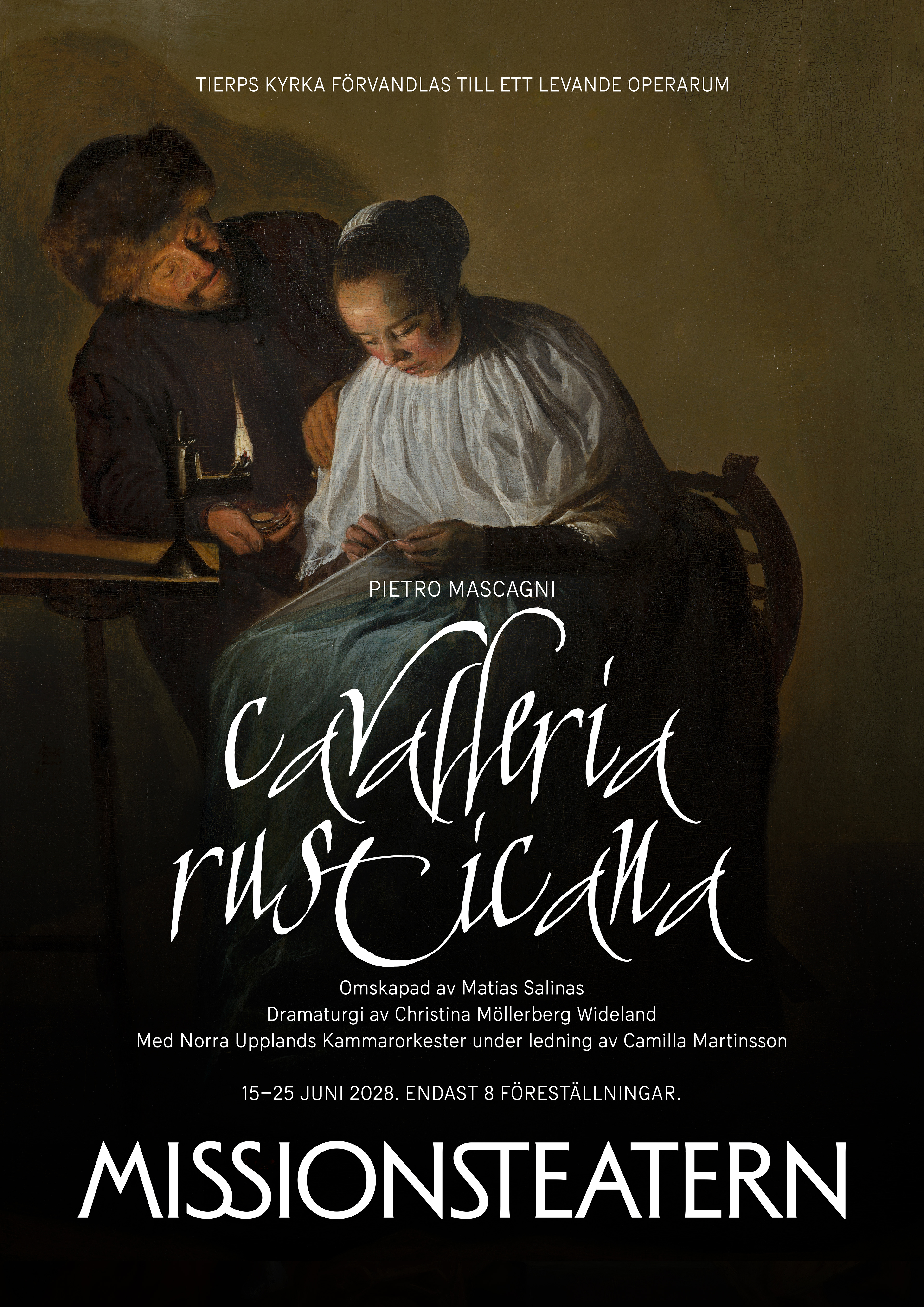
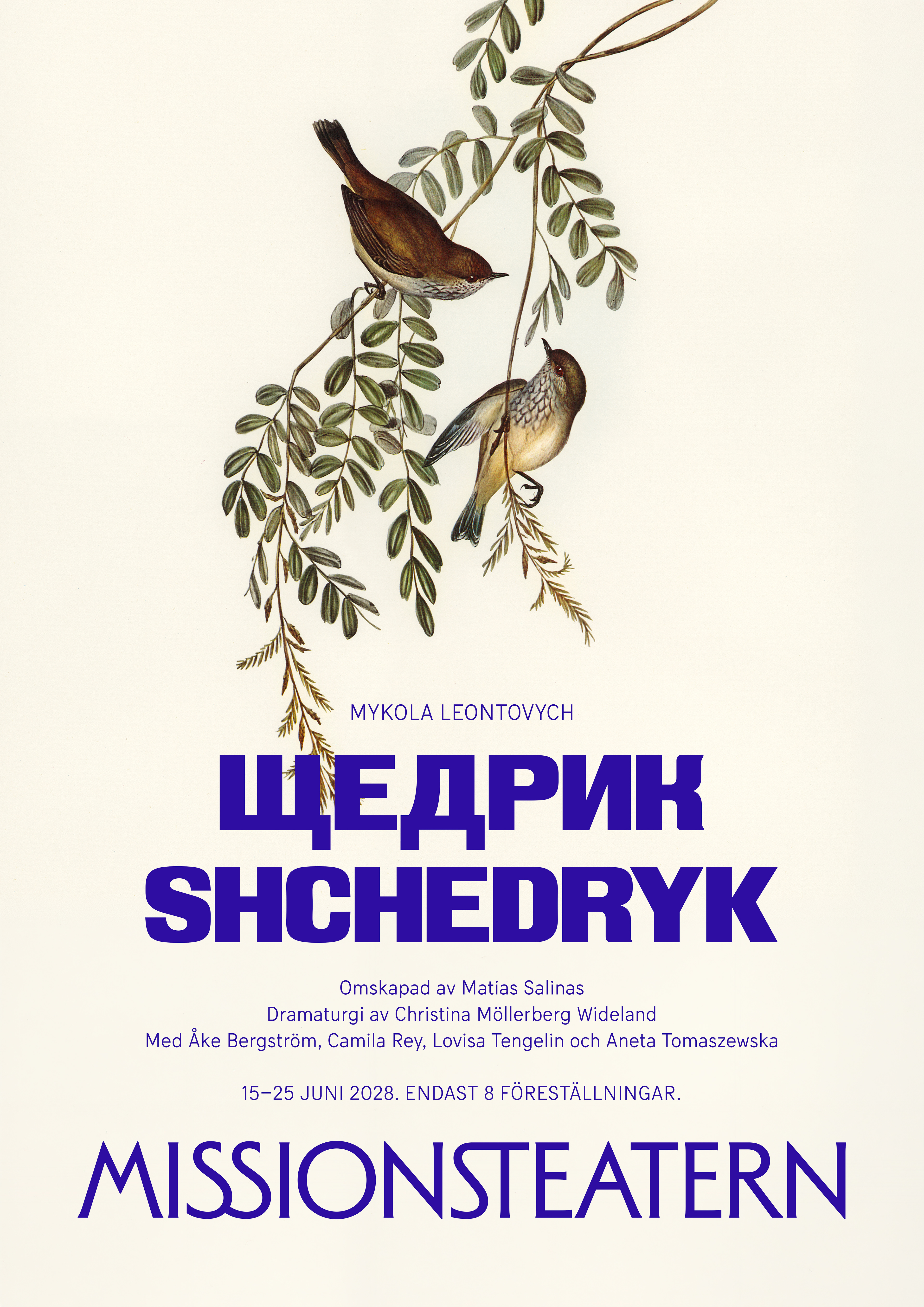
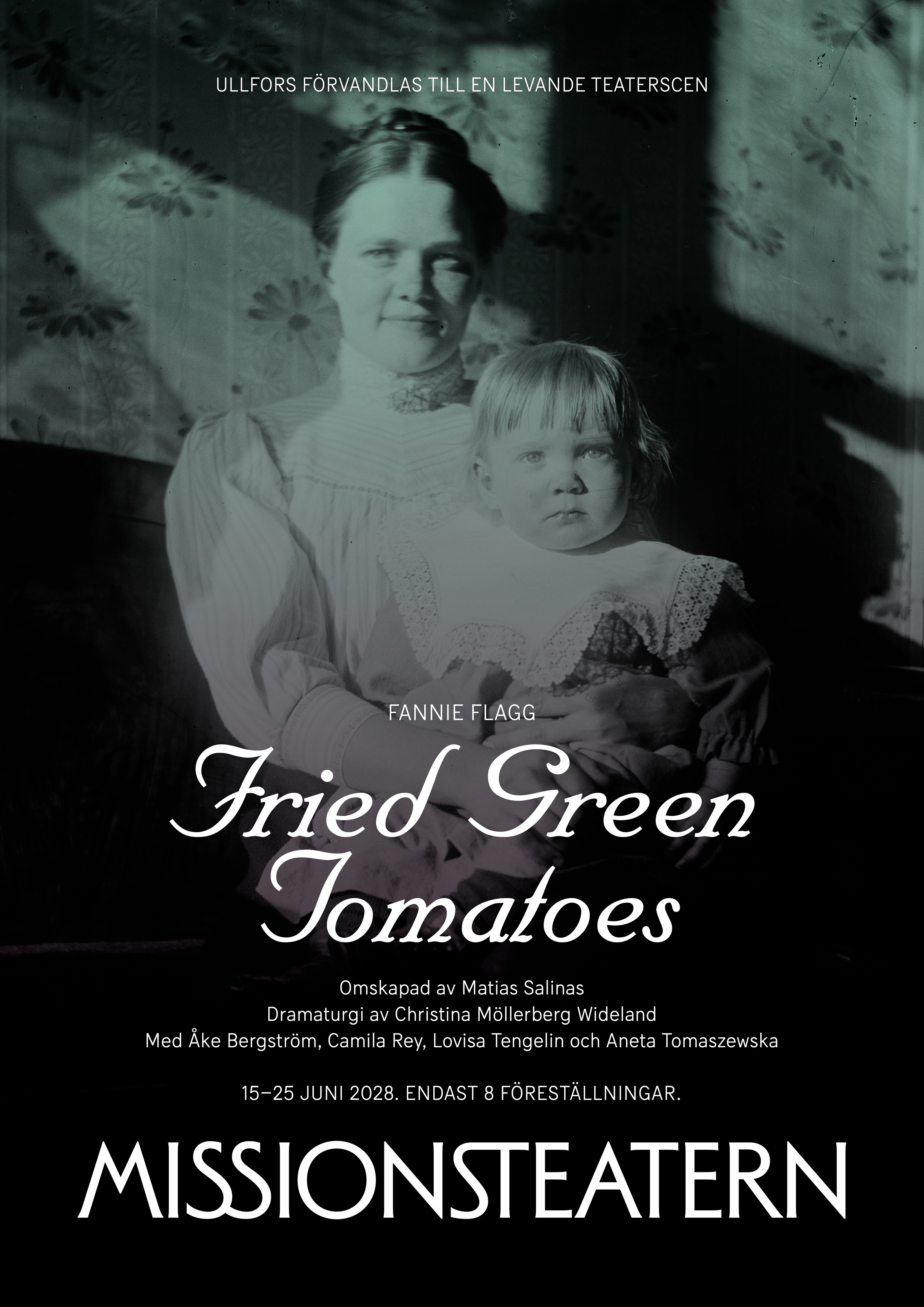
Visual identity and art direction for Missionsteatern, a laboratory for artistic research based in Sweden, on a mission to create engaging theatre experiences in unexpected locations for curious people.
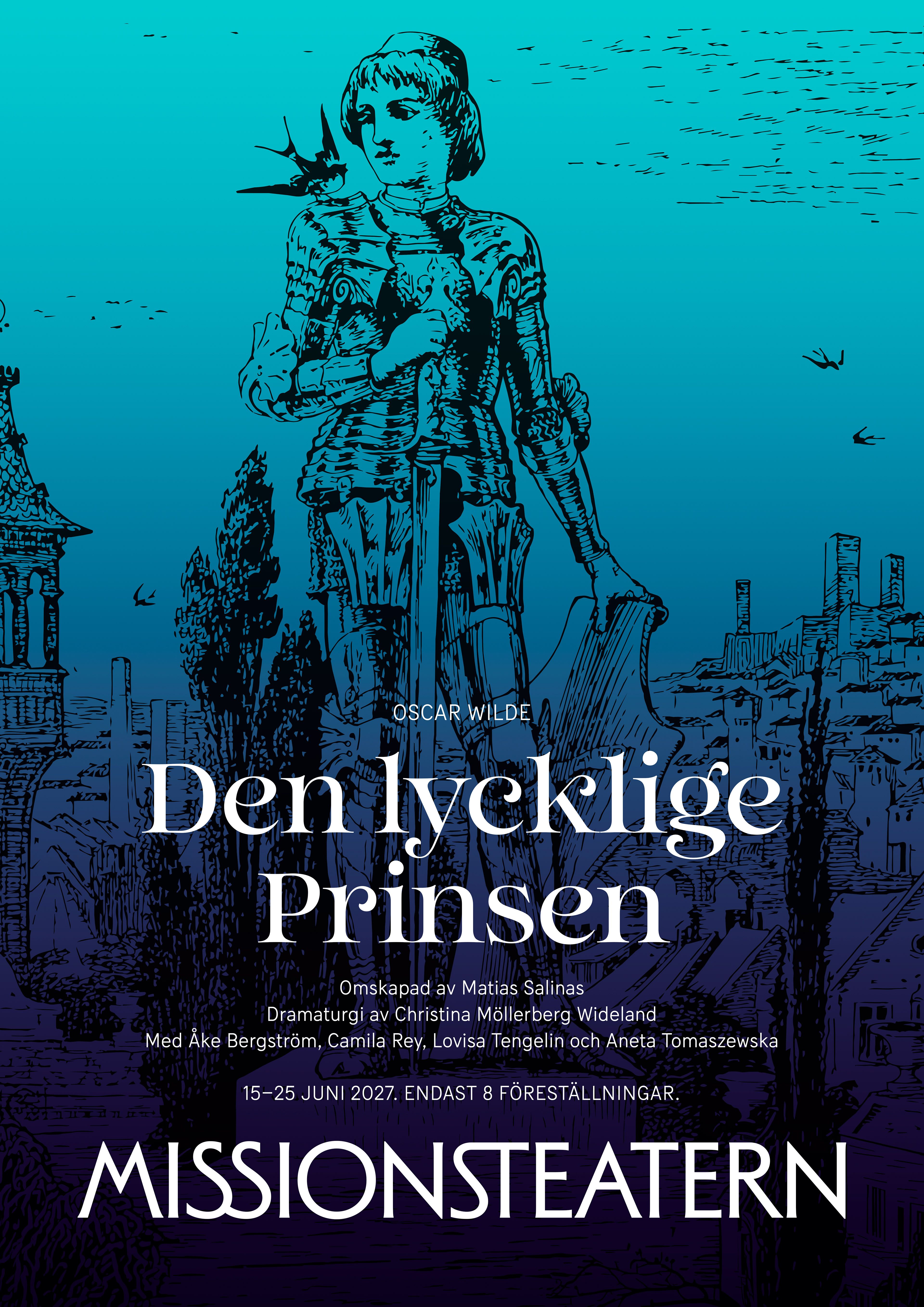
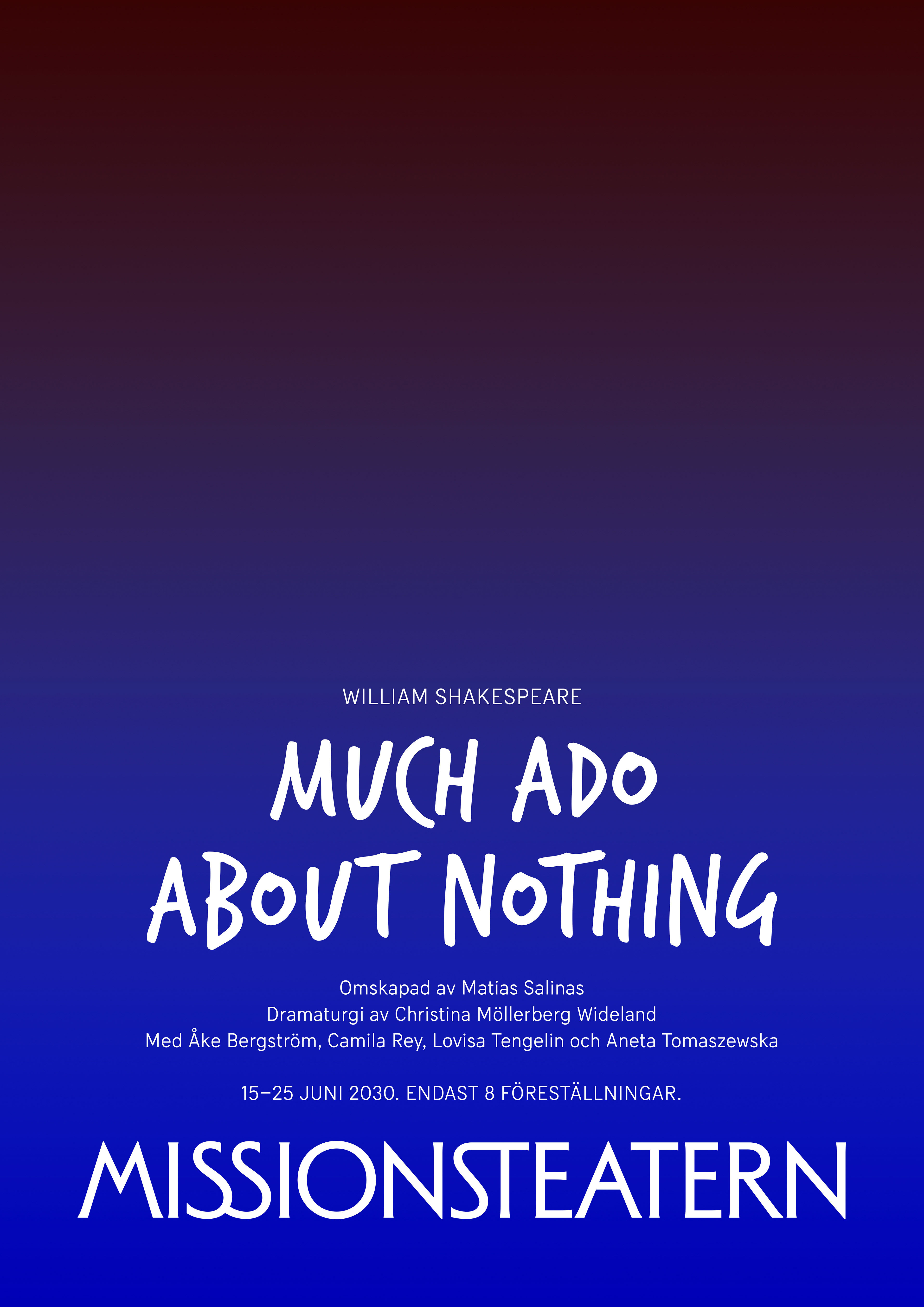
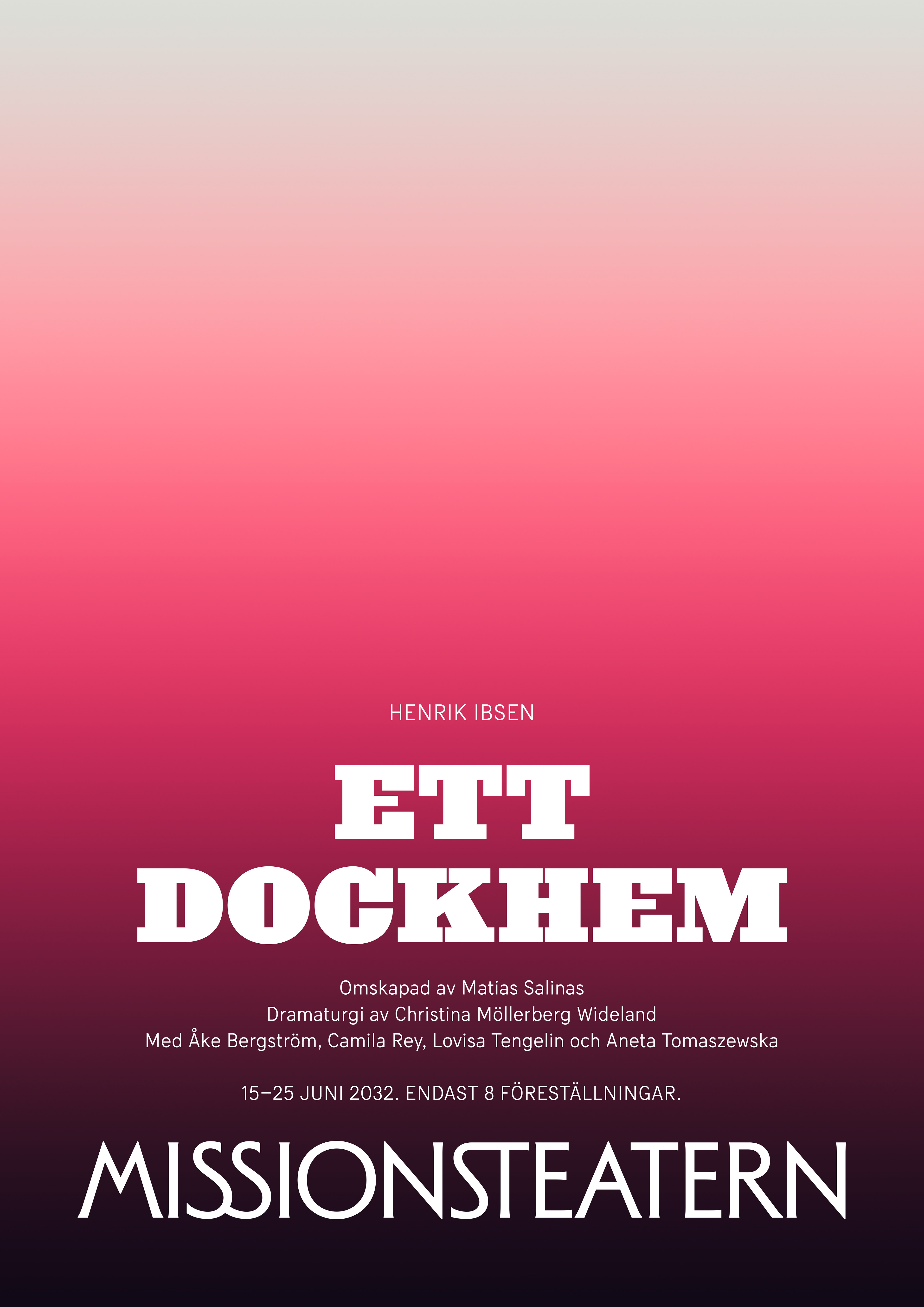
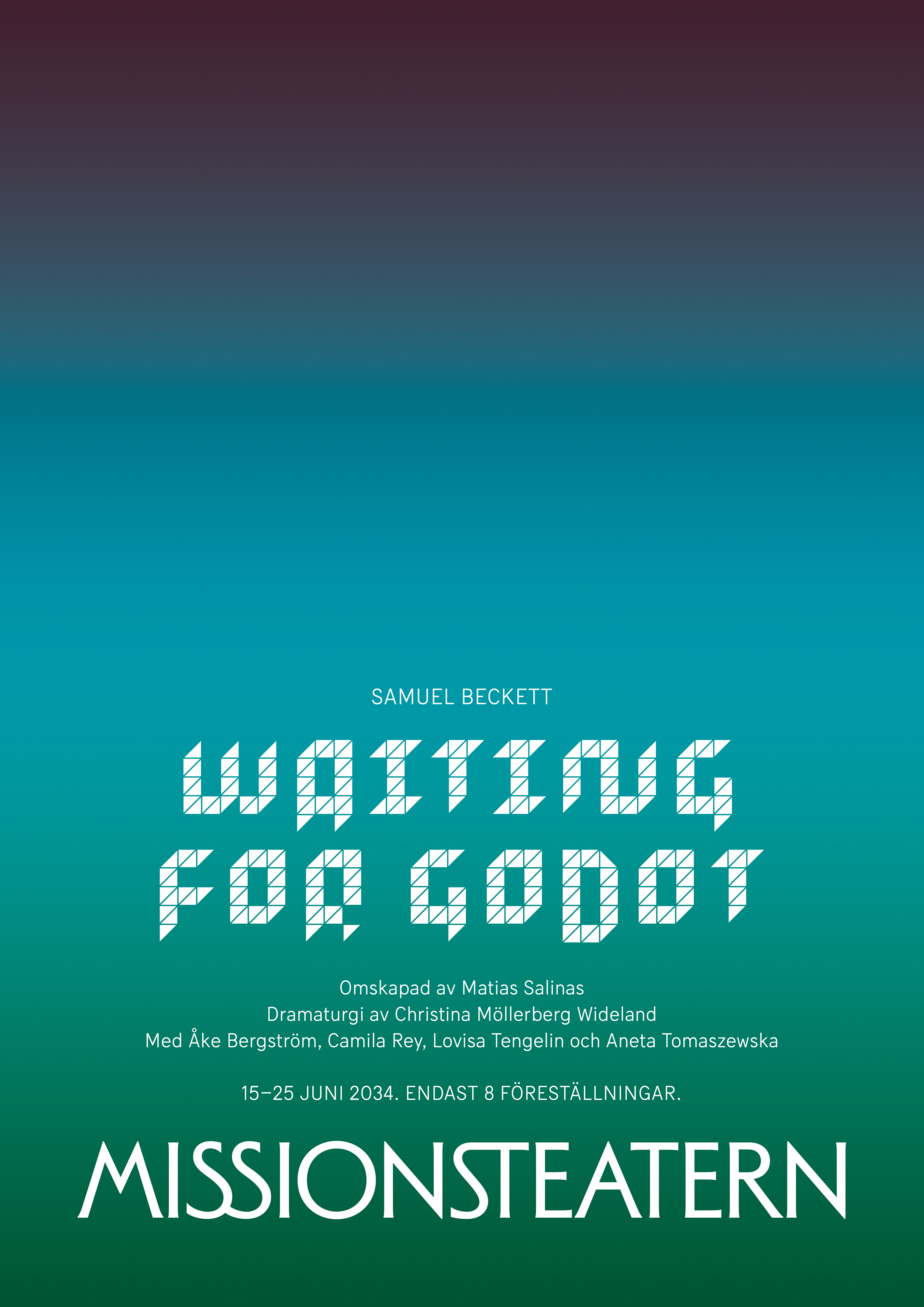
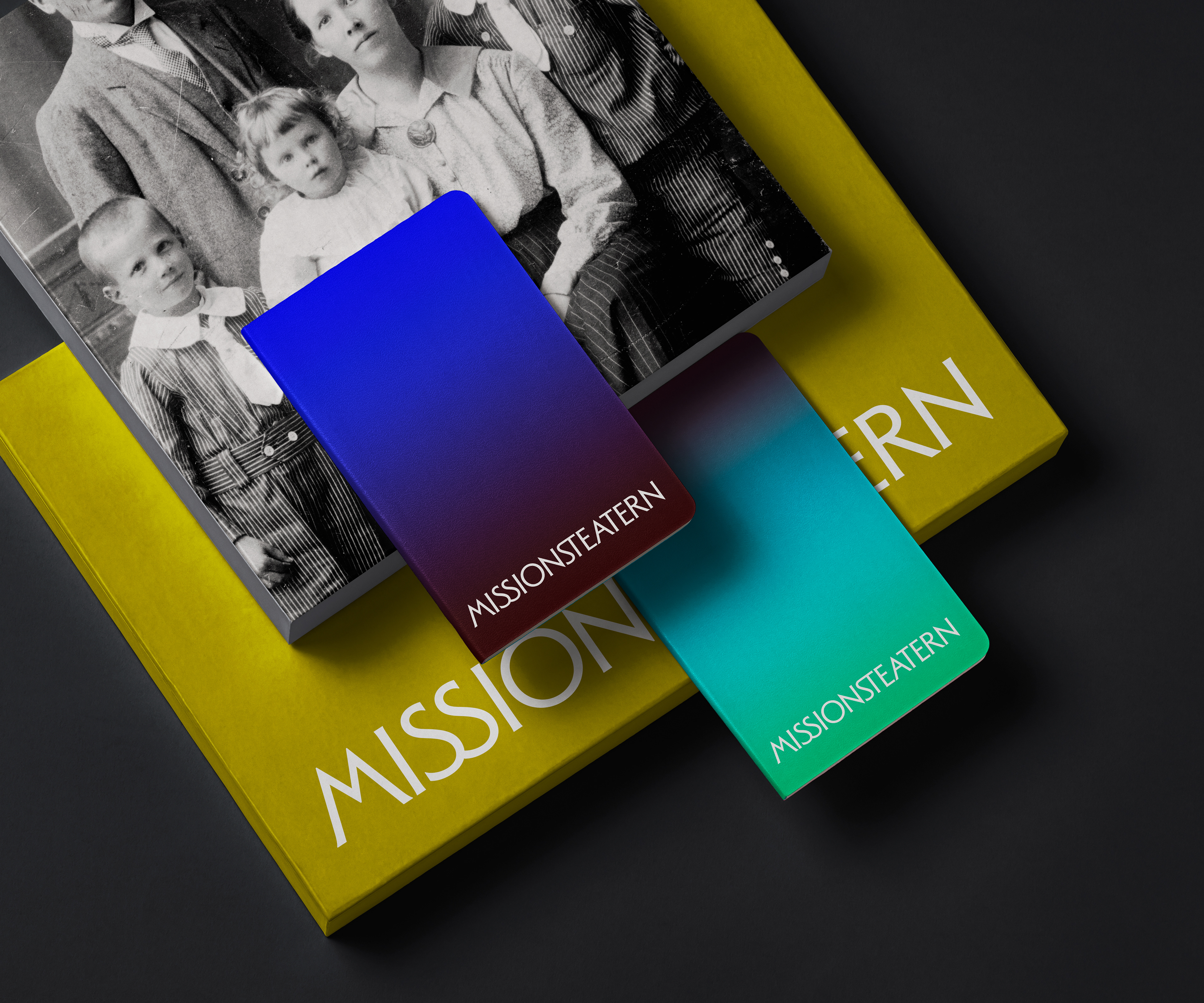
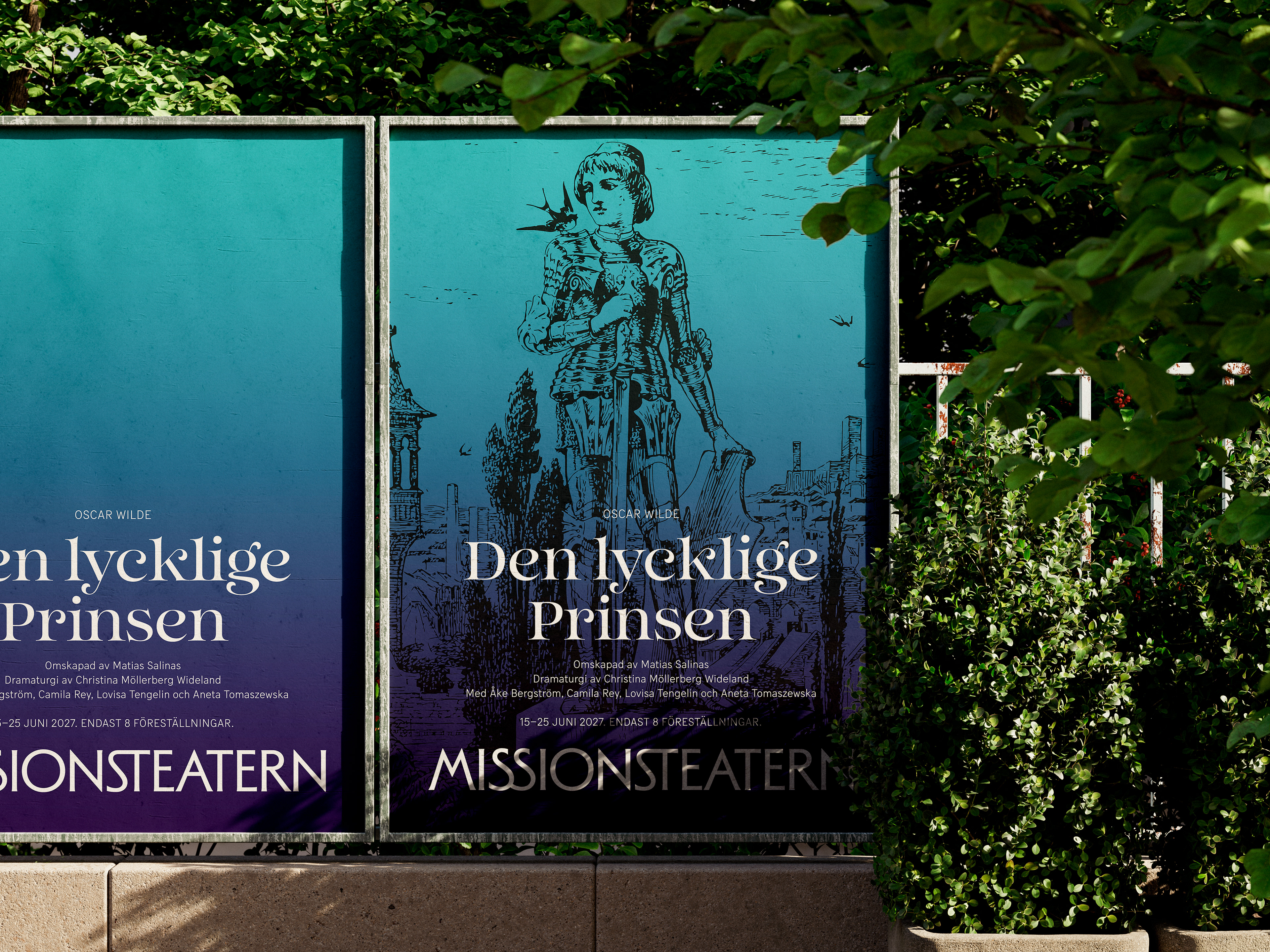
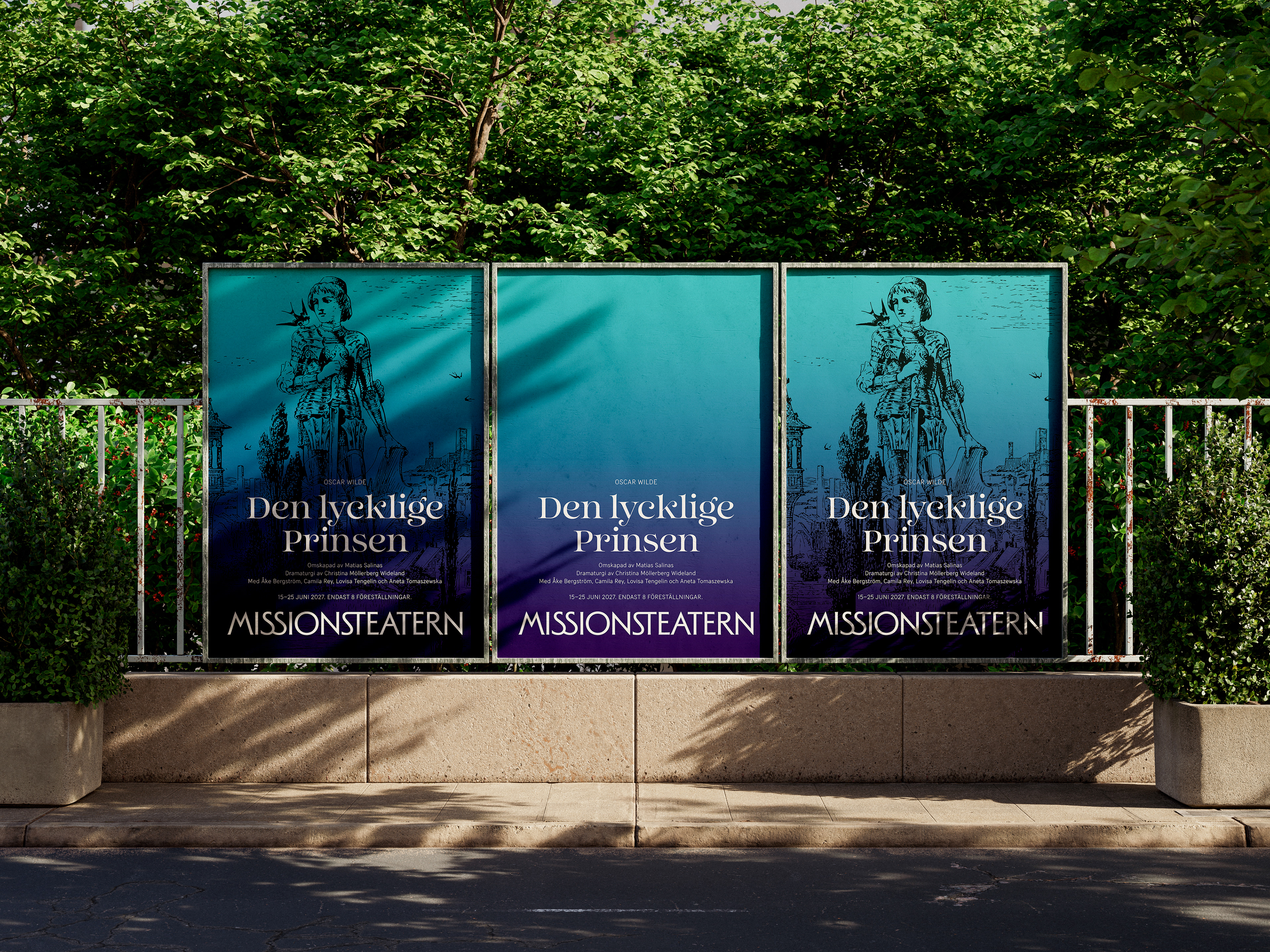
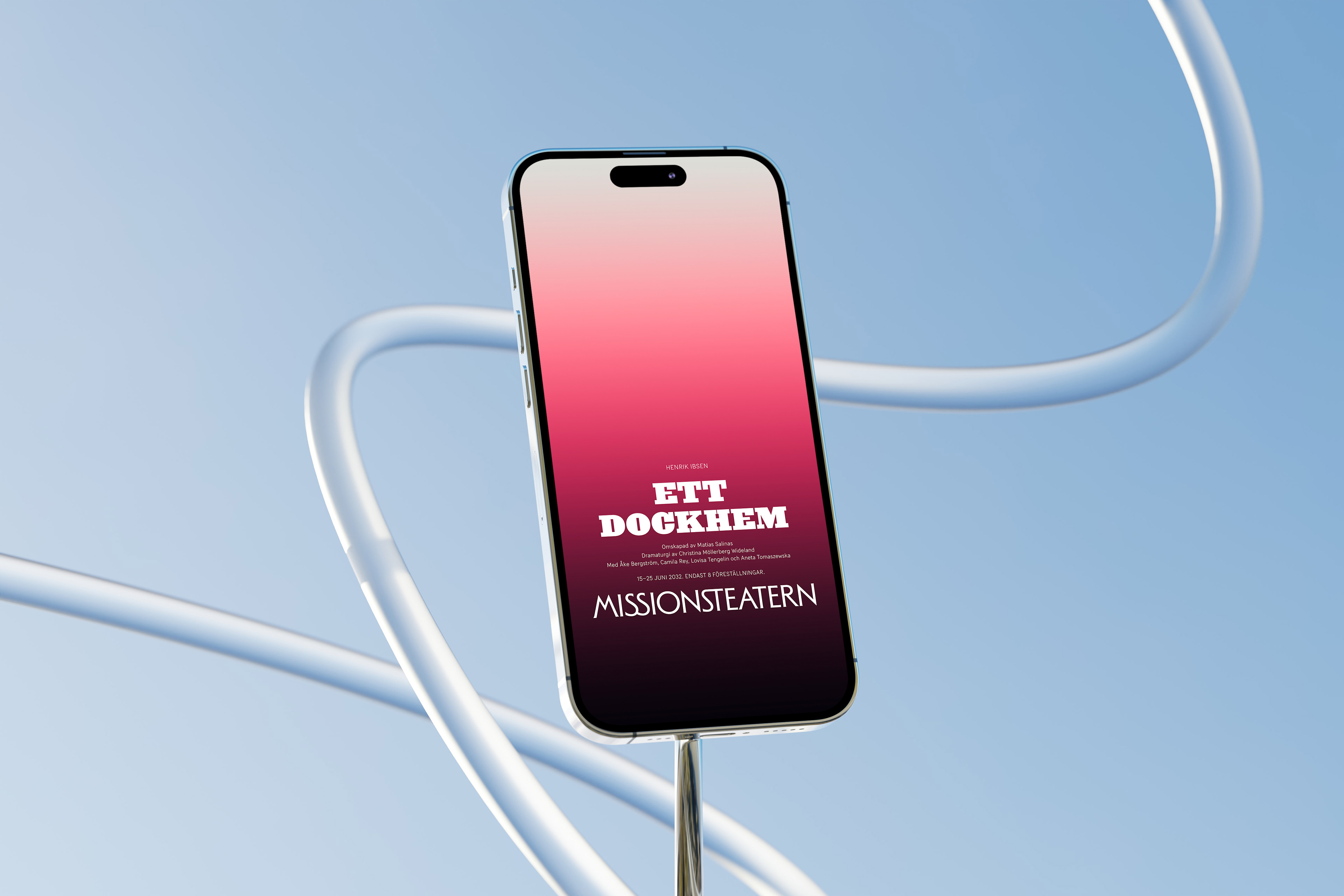
The visual identity is built around two core elements: colour and typography. While the logo and supporting typography are set in typefaces designed by Swedish type designers, each production title is set in a typeface created by a designer from the playwright’s country of origin.
This approach transforms typography into a narrative device, allowing each play to carry traces of its own cultural context while remaining part of a coherent visual identity. Complementing this typographic system is a series of carefully crafted colour gradients that bring energy, contrast, and rhythm to the identity. Together, colour and typography create a flexible visual language that celebrates the diversity of stories presented on stage.
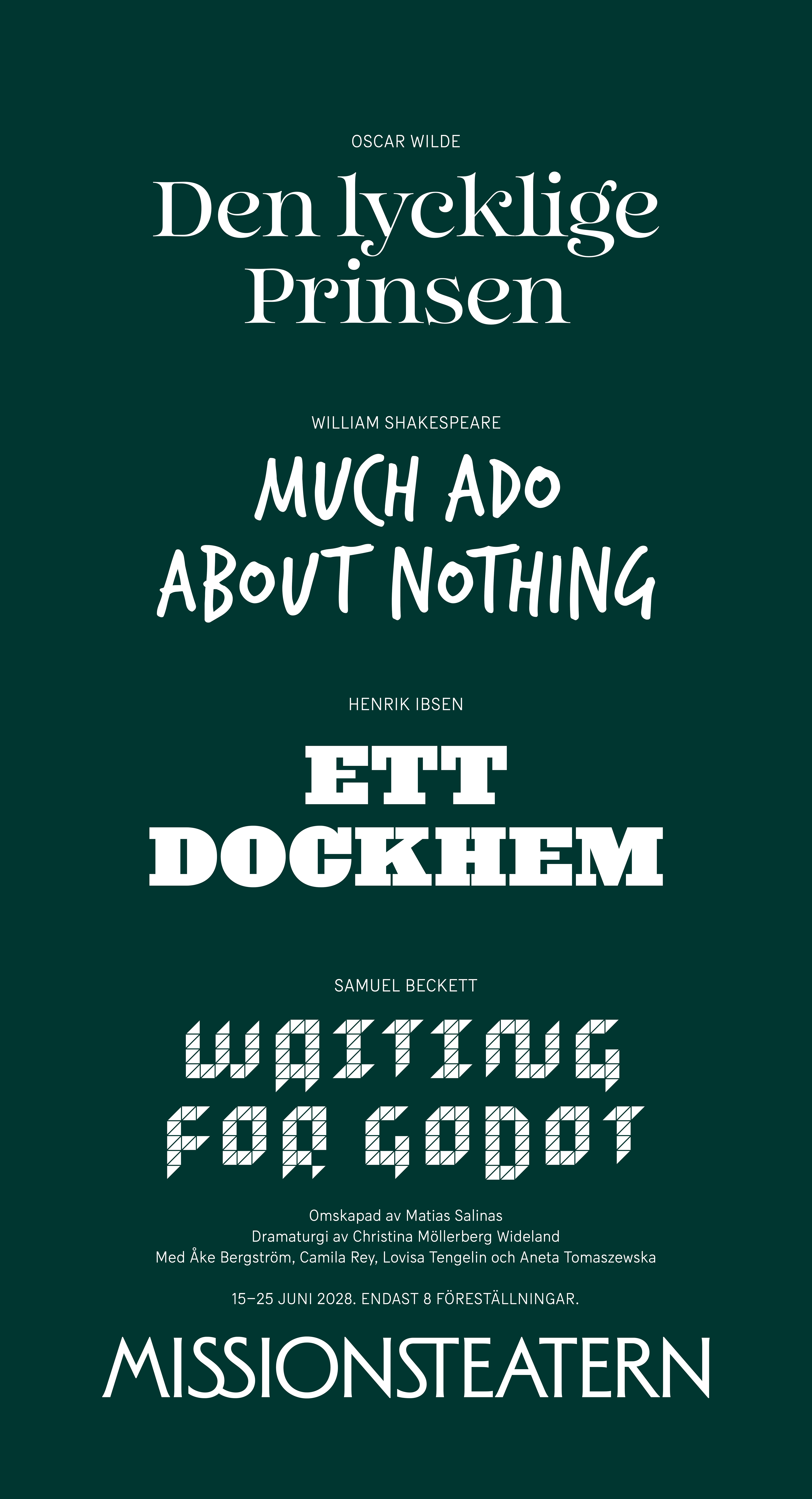
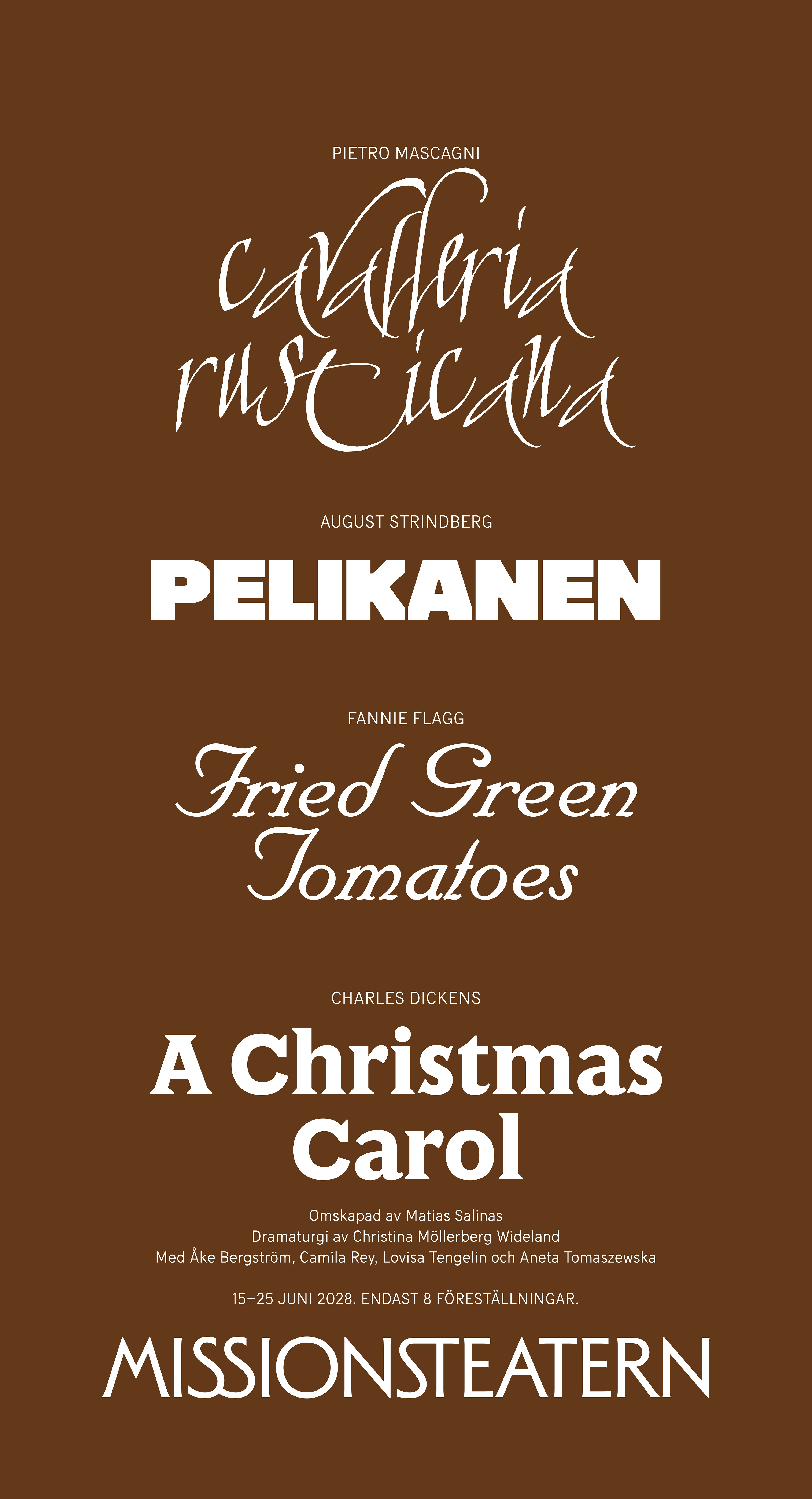
Typographic explorations in dialogue with diverse visual languages
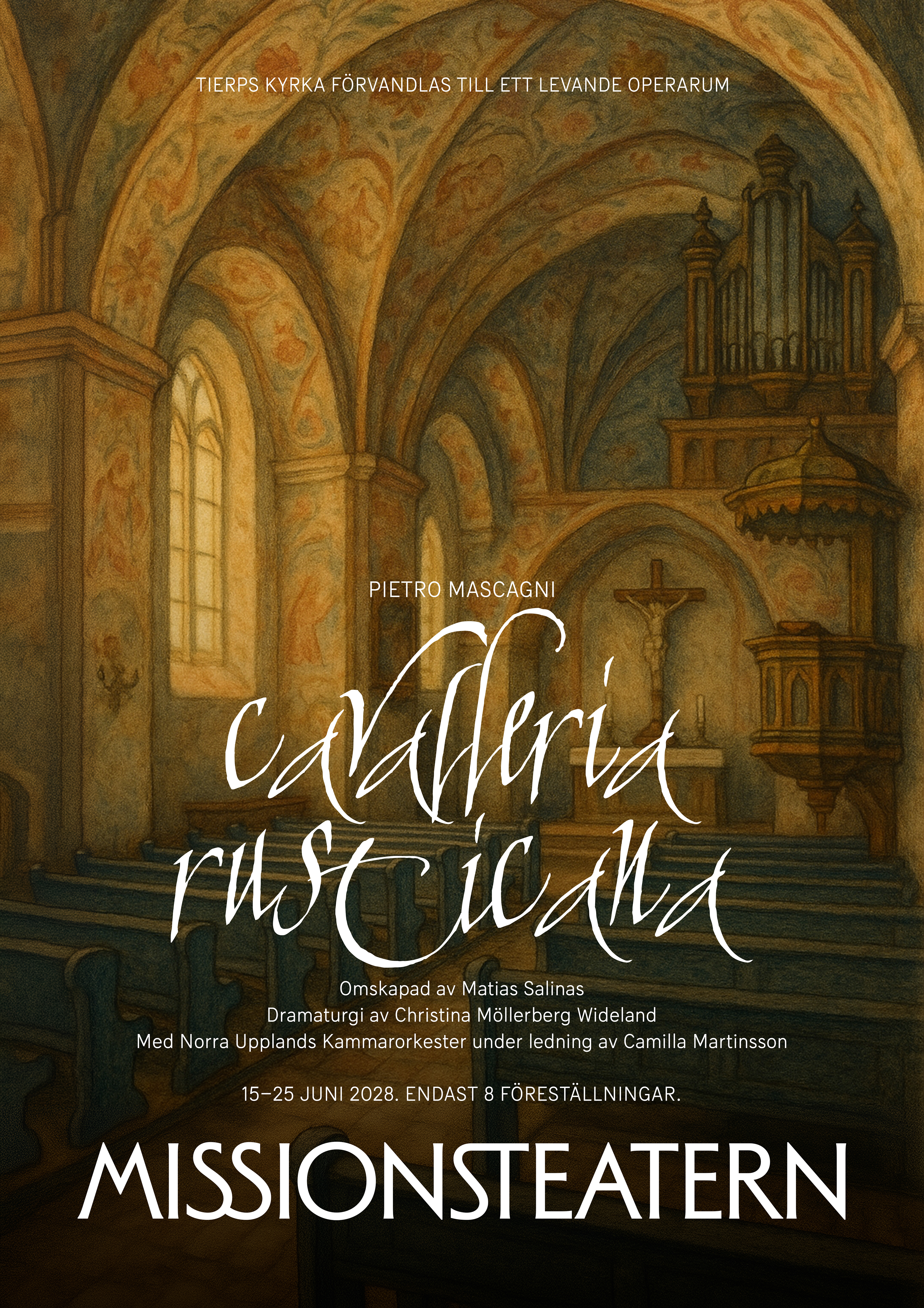
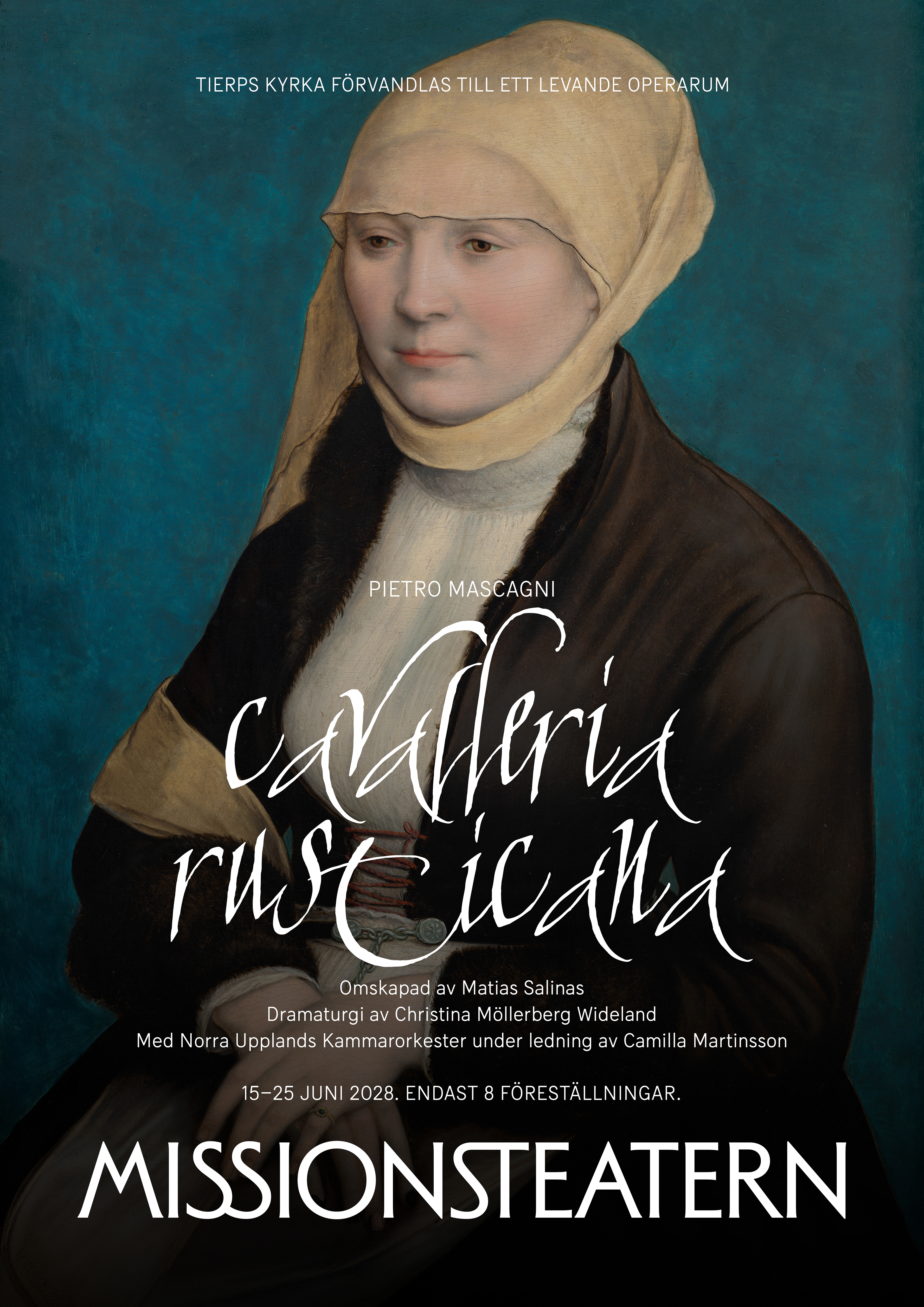
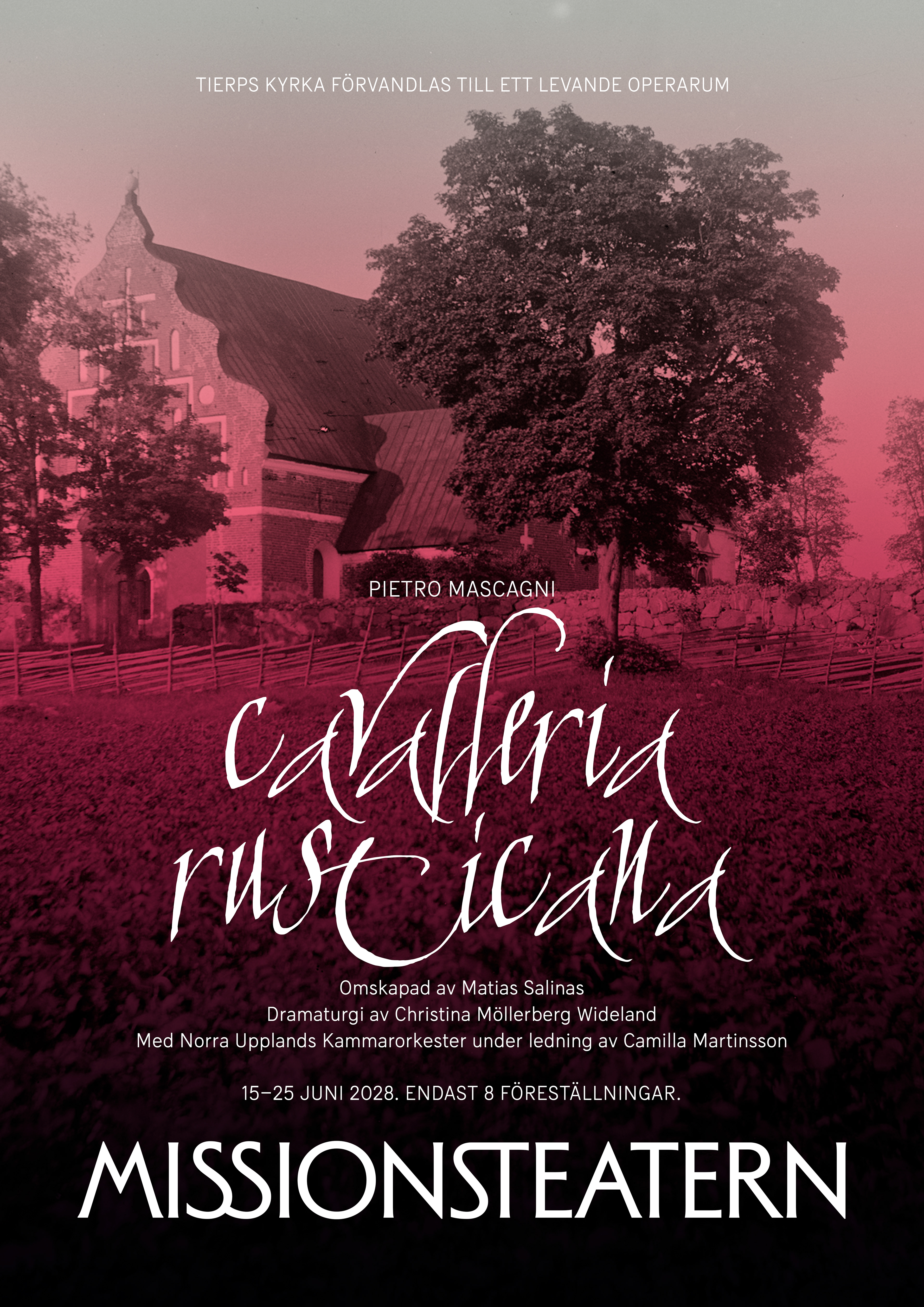
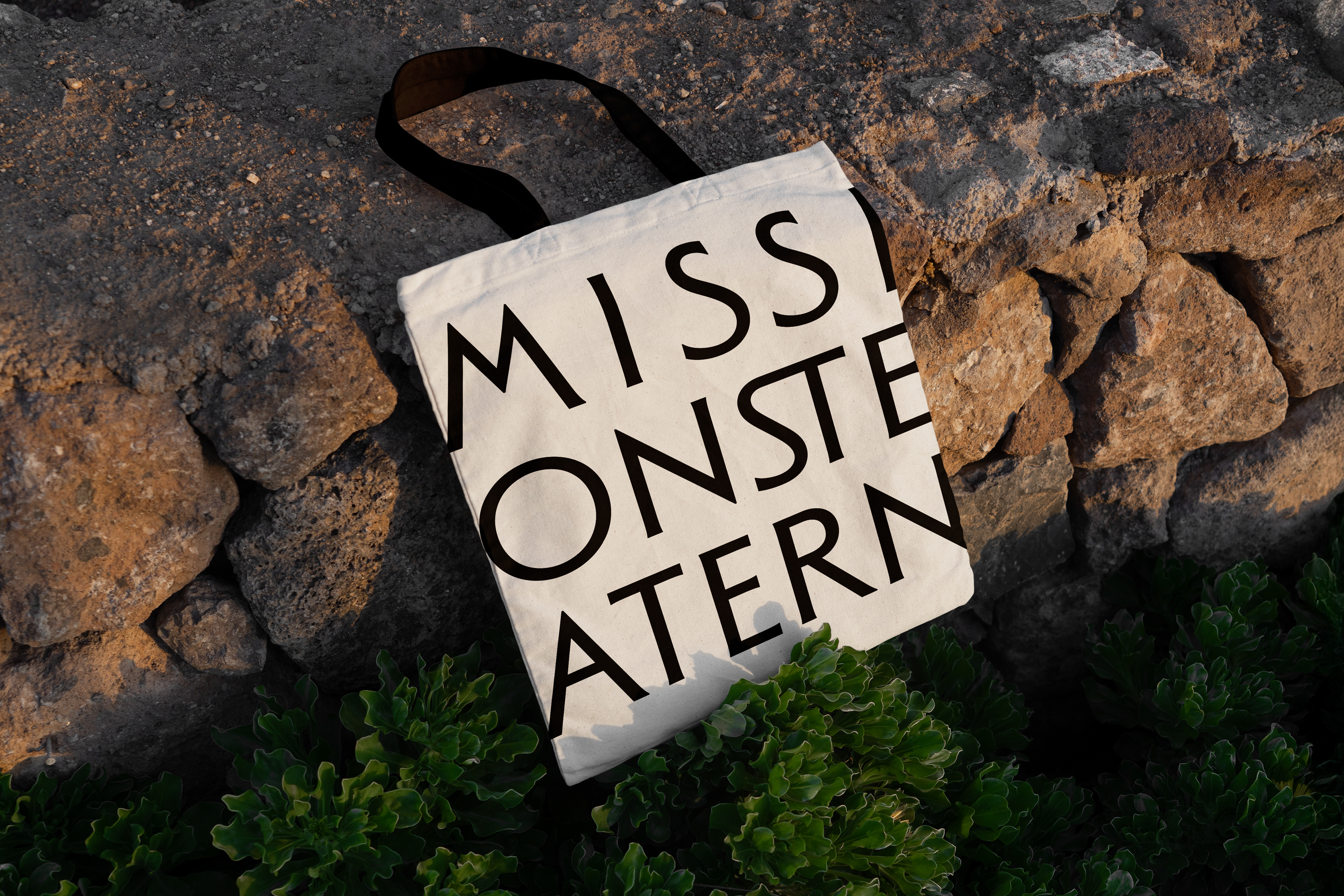
The visual identity applied to printed and digital communication